Marvin is a teletherapy platform providing hospital employees with mental health teletherapy and resources.I started working as the sole designer of Marvin in September 2020 to build out all patient and provider-facing apps.
While designers had previously wireframed waiting rooms, video sessions, and scheduling experiences, we needed a comprehensive provider platform that could scale with the influx of patients and therapists.While at Marvin, I spearheaded the end-to-end design of Marvin’s provider experience.
To design appropriate solutions, we needed to understand the perspective of our target users, Marvin therapists.Based on our research and user interviews, we understood the main opportunity would be to offer a streamlined experience for providers.This meant a design encapsulating all aspects of teletherapy, from seeing a patient safely to submitting the necessary documentation to bill insurance and get paid for that session. We synthesized the research and defined our user needs.
Reviewing the Previous Wireframes
Marvin designers had previously focused on wireframing scheduling and availability features. These were important features because of the feedback from users (healthcare workers), who often have shifting and atypical schedules.
Defining the information architecture
We needed to define our product’s information architecture and features to build the platform from scratch.In the early stages and workshops, we were able to think of more innovative and creative ideas like mapping client body language with machine learning, in-session art therapy exercises, and custom waiting room features.After synthesizing our learnings and ideas, we defined our architecture and features.
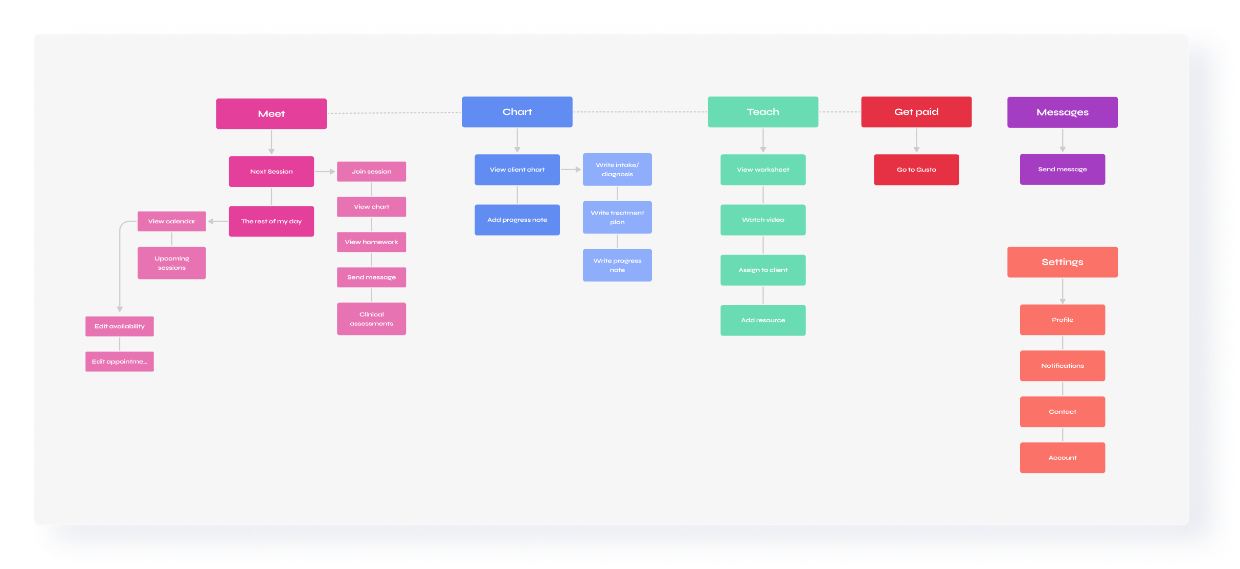
In the first iteration, the navigation was a bit busy. It included many features as separate navigation options, so I conducted internal card-sort exercises and condensed the 9-option navigation to 5 and finally to 4 after user feedback. We wanted to keep the experience tied to our patient-facing app, which uses actionable keywords for the main navigation.
V1 (previous designer)
Dashboard
Appointments
Messages
Caseload
Forms
Availability
Notifications
Help
Settings
Waiting room
V2
Dashboard
My Patients
Calendar
Assign Exercises
Messages
Get Paid
Waiting Room
V3
My Dashboard
My Calendar
My Messages
My Caseload
Assign Exercises
Get Paid
V4 (Current)
Meet (Dashboard, My Calendar, Waiting Room)
Chart (My Caseload)
Teach (Assign Exercises)
Get Paid
Defining the Main Flows
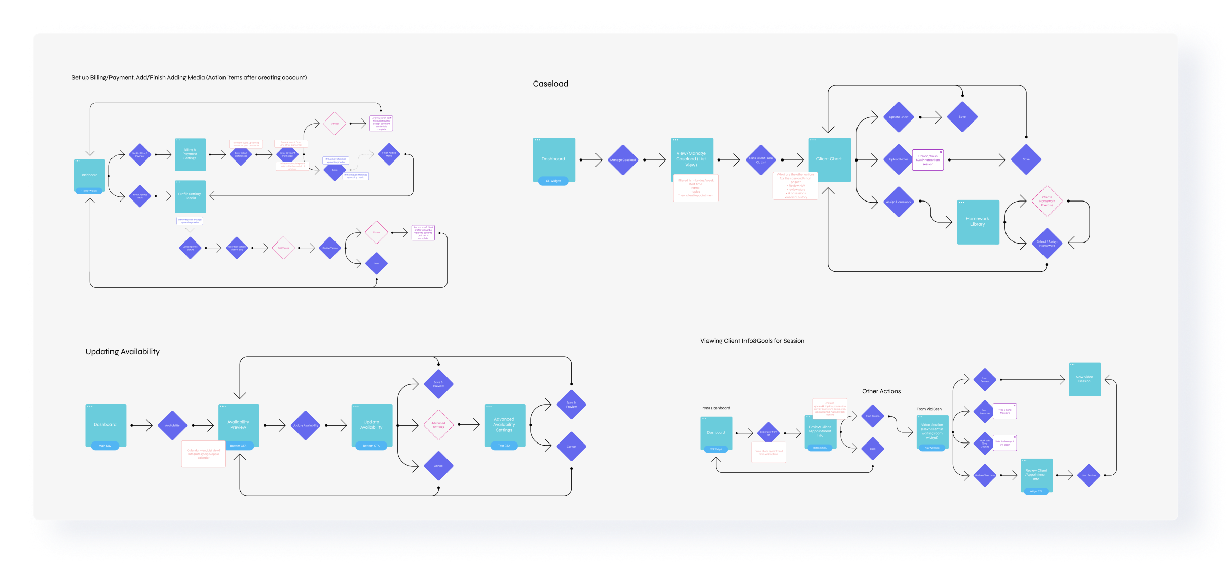
After synthesizing our research and defining the information architecture, I lead efforts by mapping out user flows for each of the different journeys our therapists would need to take, beginning at registration/onboarding and taking users through adding/updating their availability, viewing their caseload and individual clients, and joining their waiting room/video sessions.
Wireframing
I created wireframes to reflect the design language I had developed for the patient app. I wanted to create seamless and uninterrupted interactions, avoiding constant modals and unnecessary screen changes so often found in healthcare provider-facing software. I incorporated UI elements like collapsible elements and menu buttons as an alternative.
Collapsible components
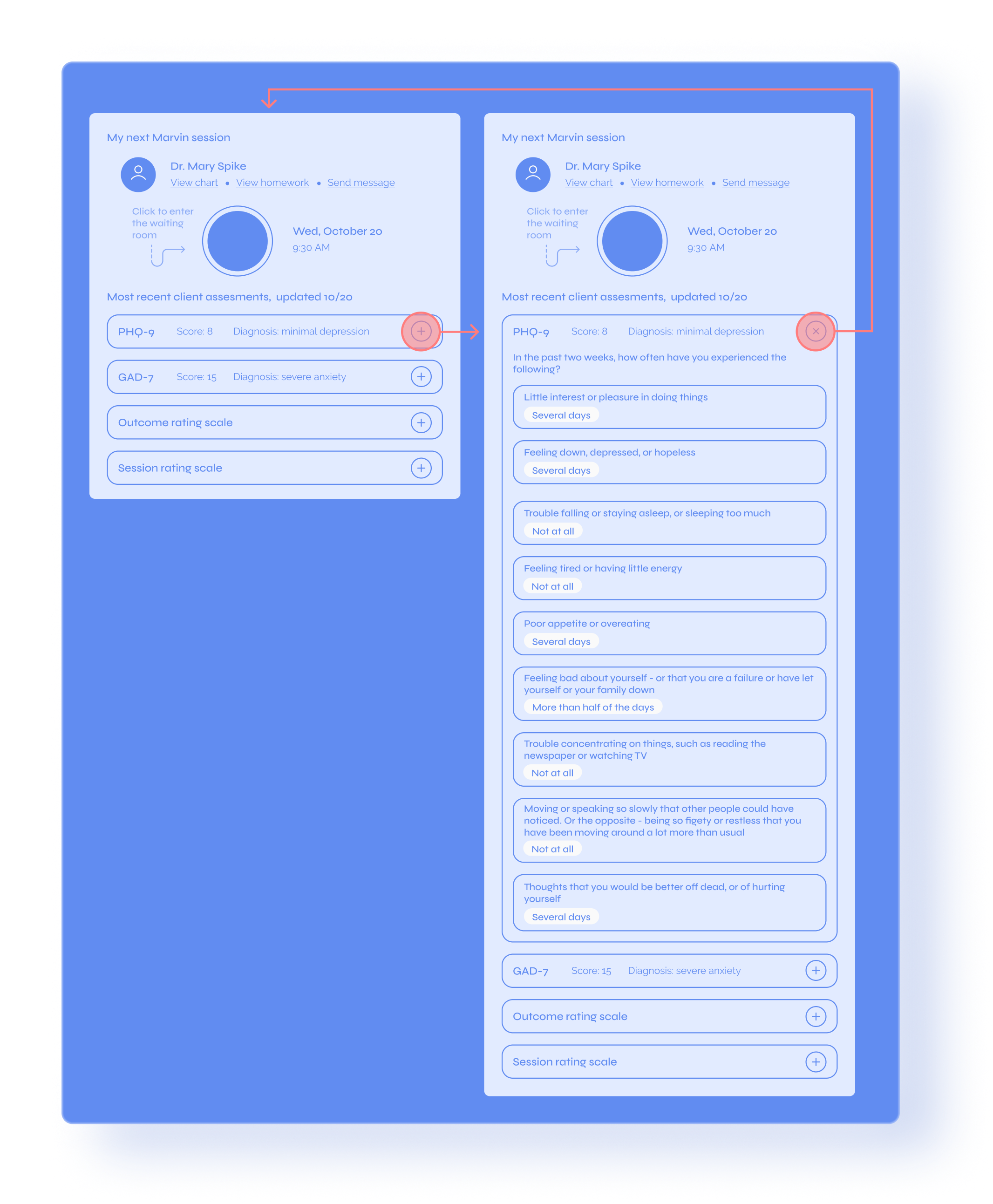
Research shows that many healthcare provider-facing apps on the market are outdated and often require users to open multiple tabs and windows to complete a single task, like assigning a diagnosis or starting a progress note. Instead of creating a difficult user flow with much room for error, I used collapsible and expandable components to show summaries of long surveys, like the PHQ-9 and GAD-7, for rescheduling/canceling sessions and as calendar components.
A streamlined experience
In addition to keeping the interface clutter-free and streamlined, we wanted to present our therapists with an unparalleled EMR experience. This meant keeping all the patients in their caseload in one place and setting up a patient charting area where they could view the patients’ information and complete any necessary tasks to get paid for completed sessions.
High Fidelity Designs
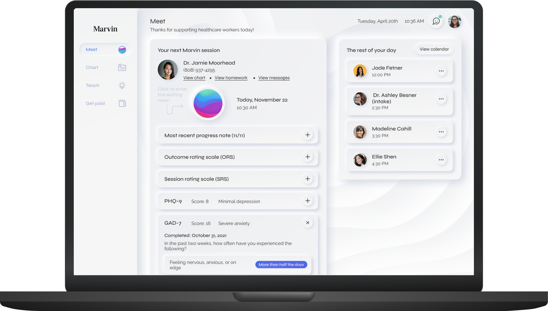
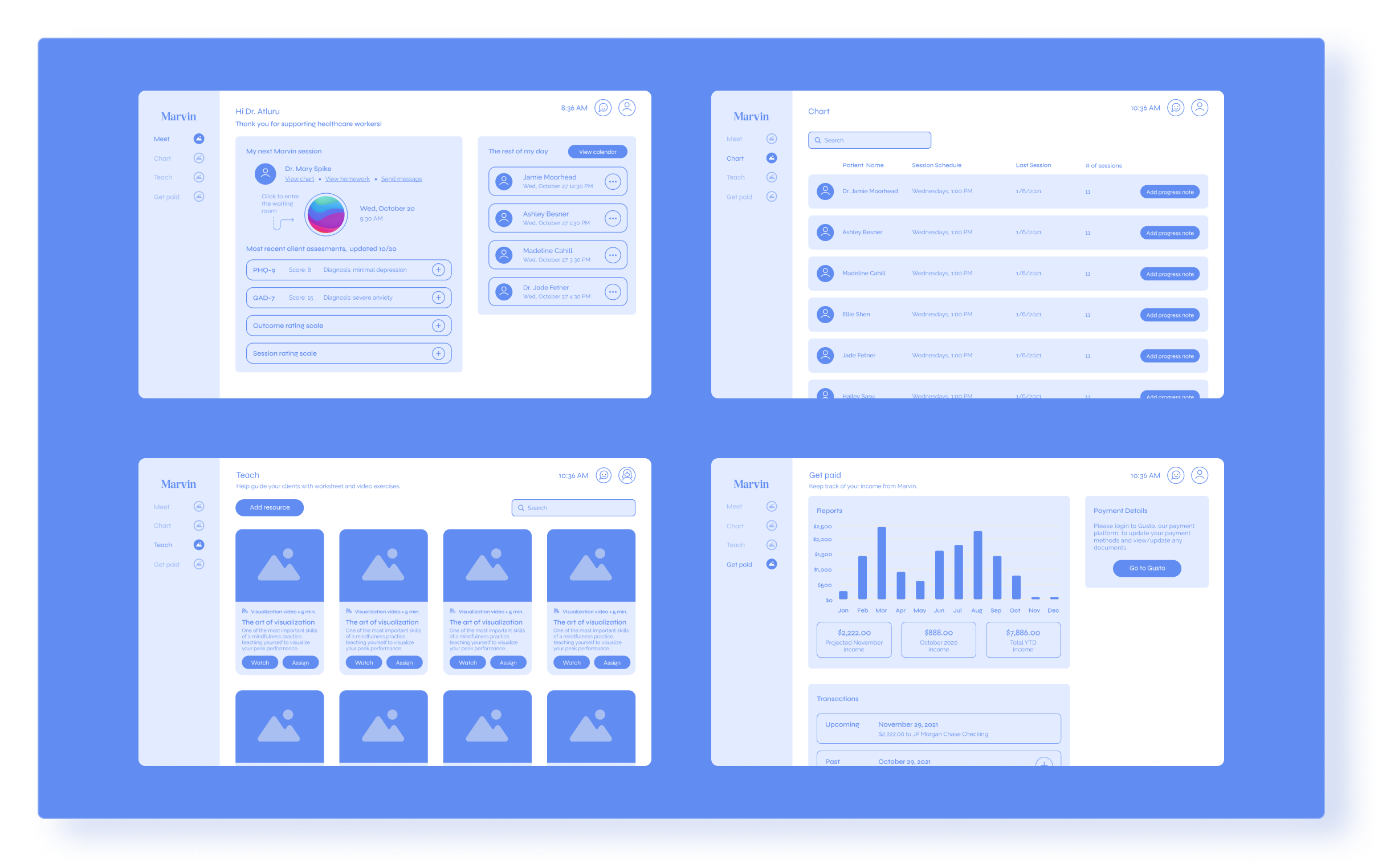
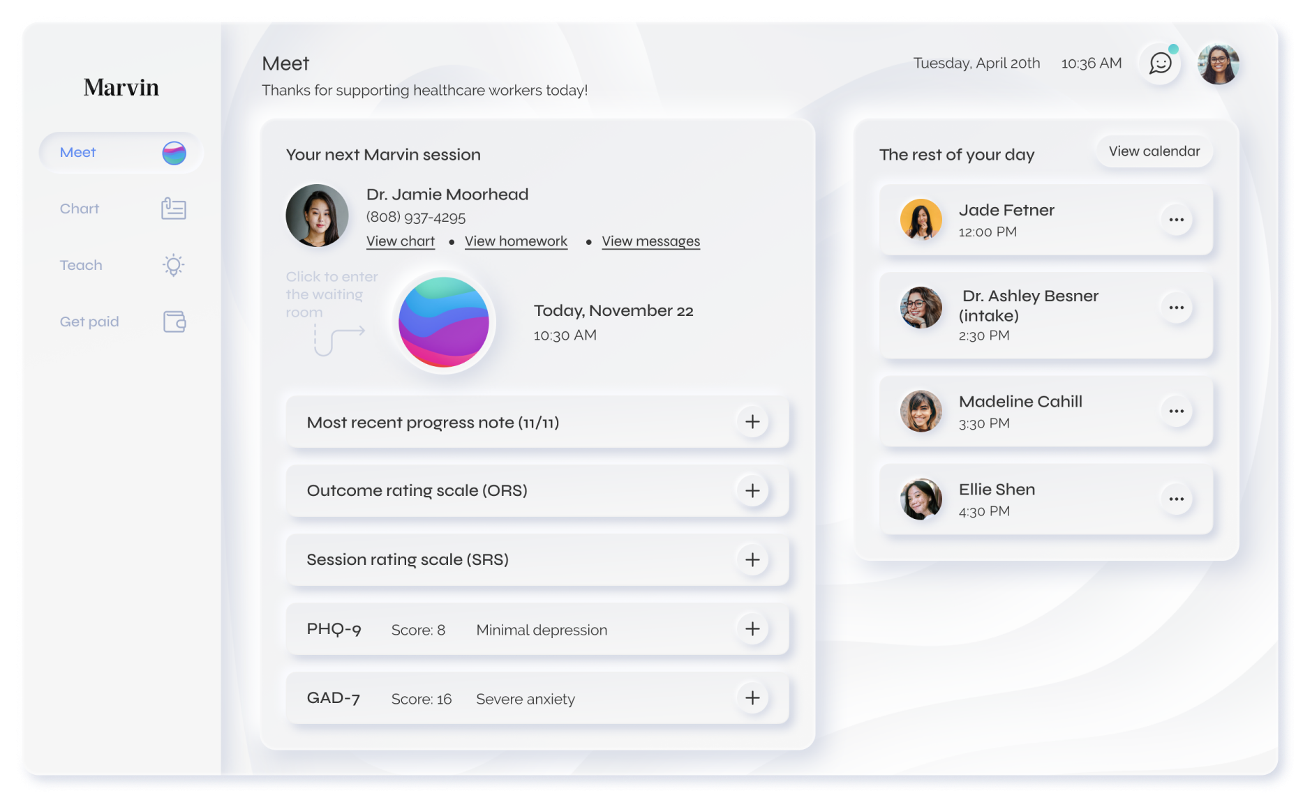
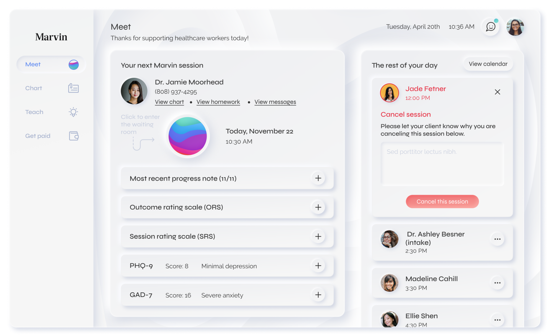
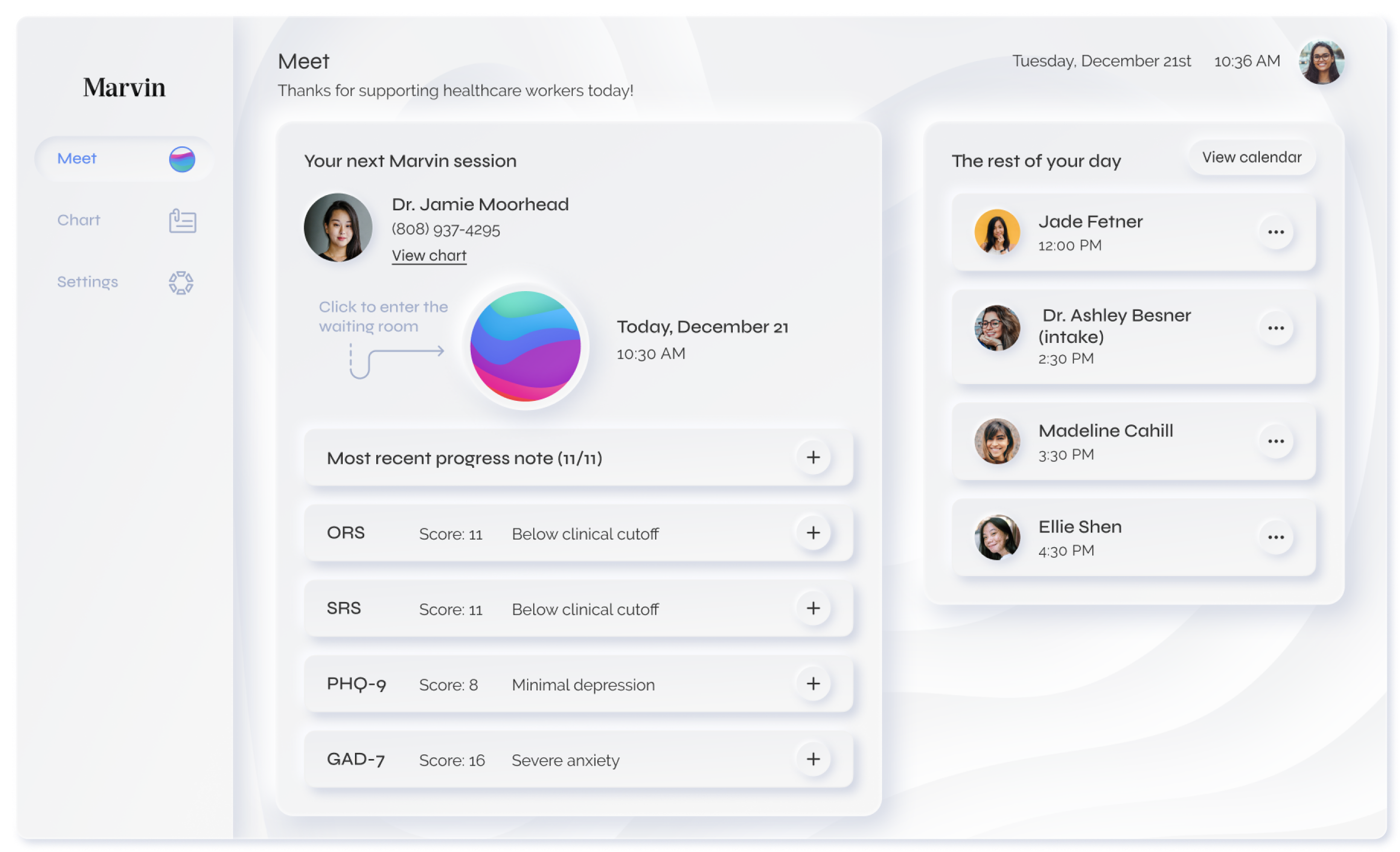
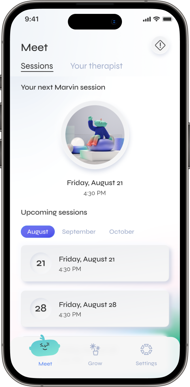
Meet
Meet serves as the home screen for our therapists and is the main screen for scheduling and session information. From Meet, users can access anything related to meeting with their patients, including viewing/editing their Marvin calendar and availability and upcoming sessions.
One insight we gathered from our research is that therapists need the ability to immediately join a session upon logging in. I designed the large circular element as a visually interesting exploration and a button to start the next patient’s session. Because therapists often have a large caseload and see multiple patients daily, they also need a way to review information about their upcoming patients quickly. We made this easy by giving the latest progress note, clinical assessments, and therapy feedback priority.
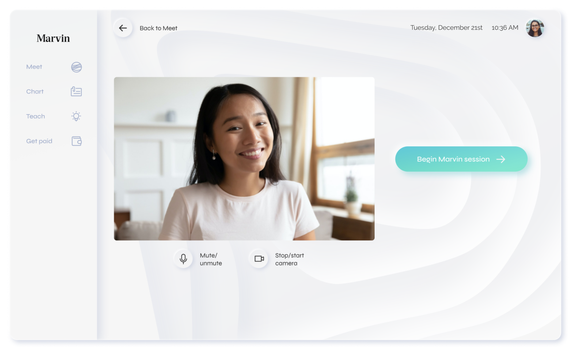
Waiting room & video session
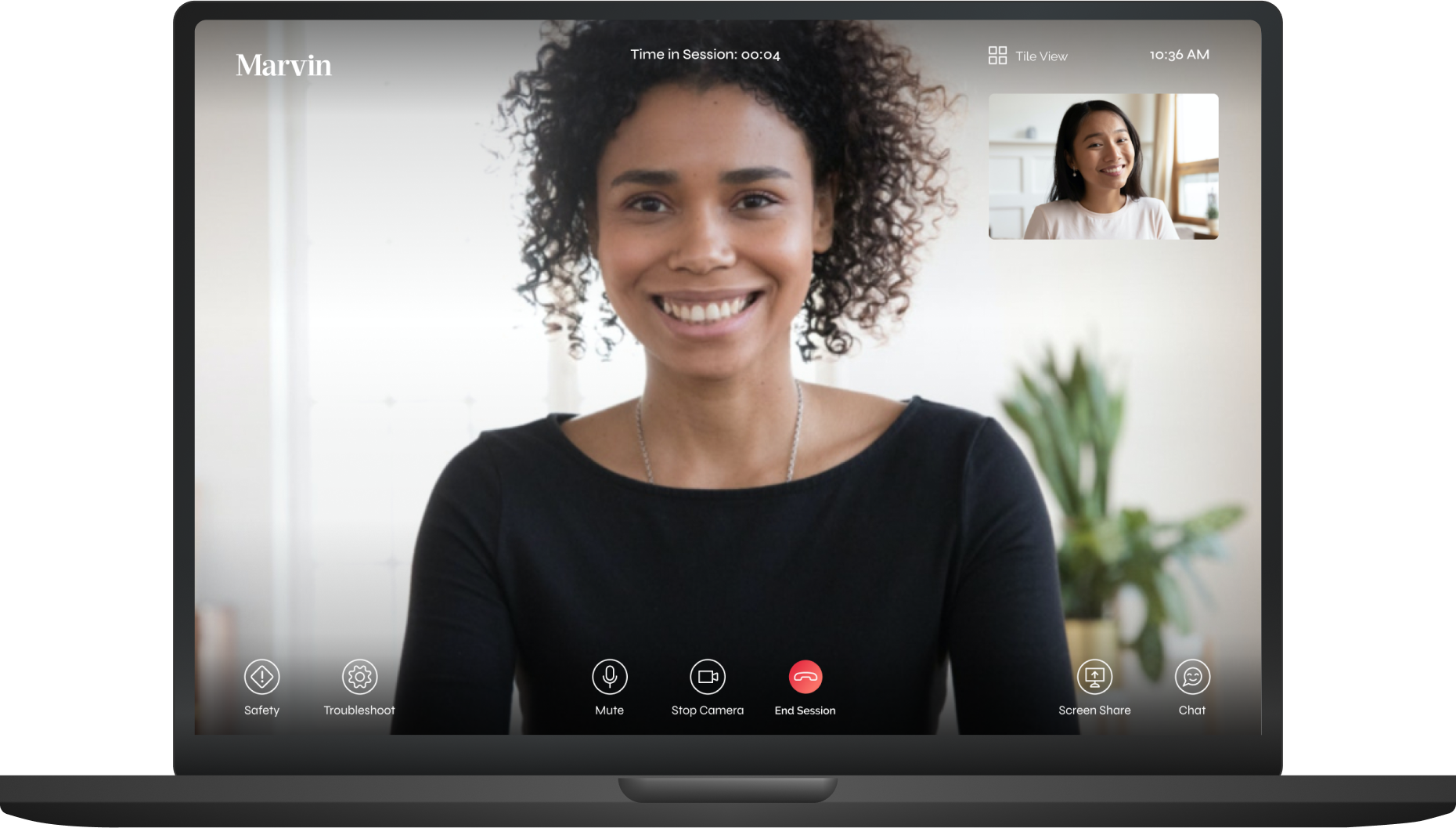
The waiting room is accessible through the home screen, Meet. Users can test their microphone and camera, and turn them on or off upon entrance into the video session.
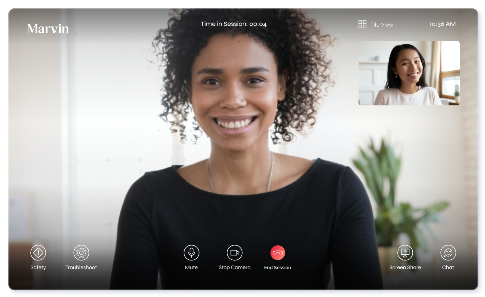
The video session was designed keeping our therapists’ needs in mind. At the top, a timer keeps track of the video session, regardless of whether the screen has been refreshed. The menu located at the bottom of the browser begins with an emergency protocol button(labeled “safety”), satisfying this user need. It also includes troubleshooting, microphone and camera controls, screen share, chat, and a button to end the session.
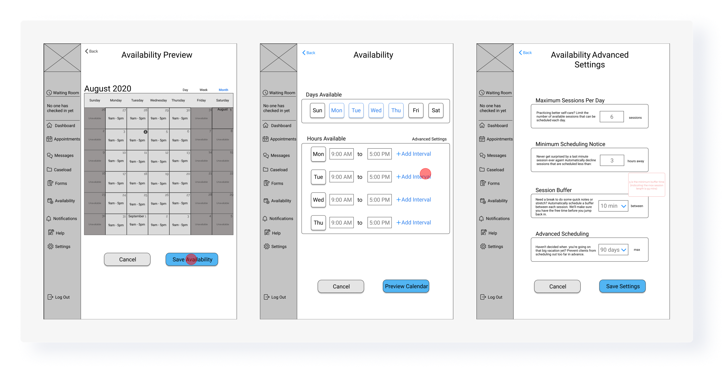
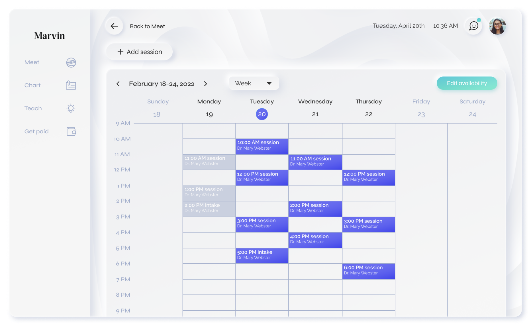
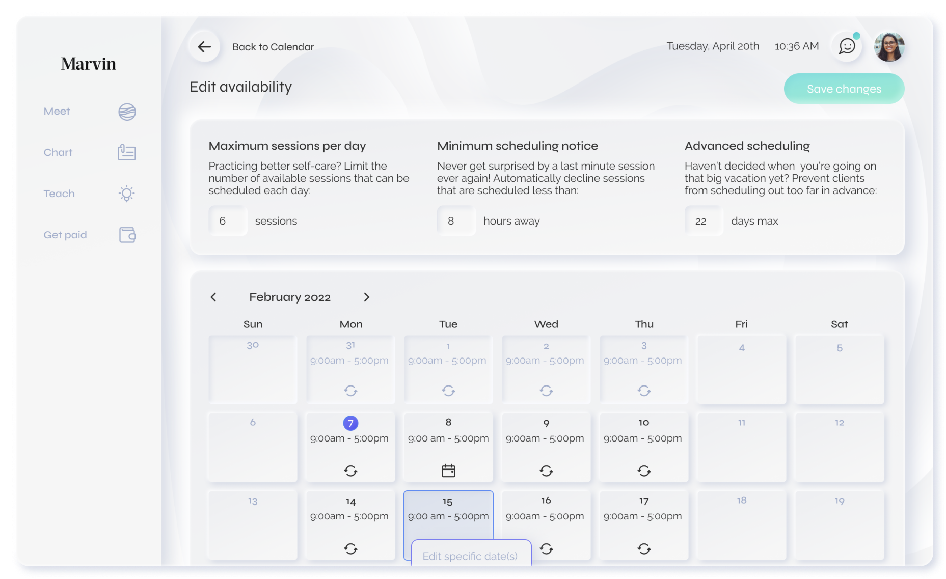
Calendar
The therapist calendar is accessible through the home screen, Meet. The inability to manage their own scheduling was a common pain point for Marvin therapists, and the addition of a calendar that connects directly to their clients and the Marvin team was a necessary feature.
From the calendar therapists can edit, add, or cancel a session, and make any updates to their availability. It is important for therapists to keep their availability up to date so they don’t get patients scheduling sessions when they are unavailable.
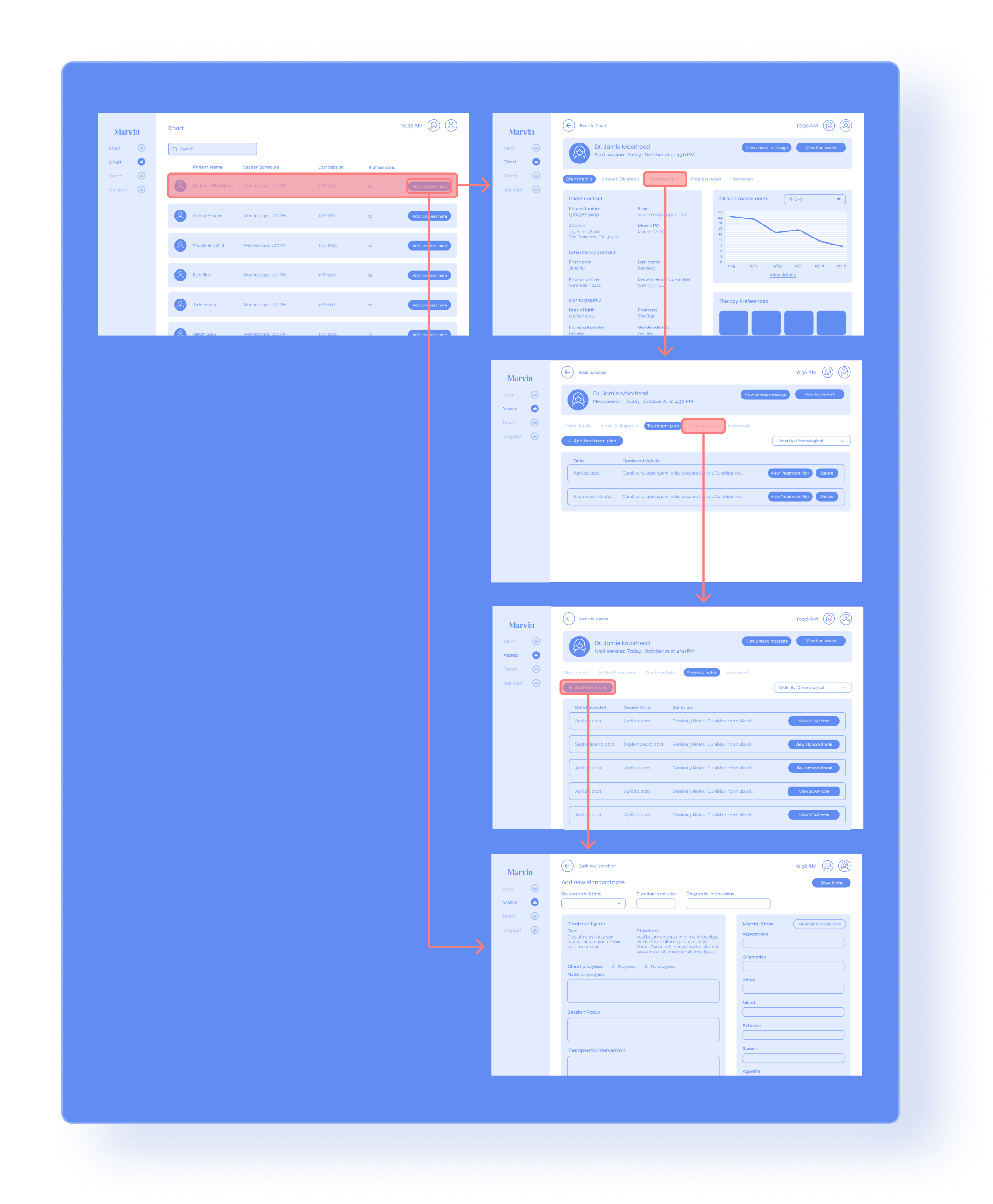
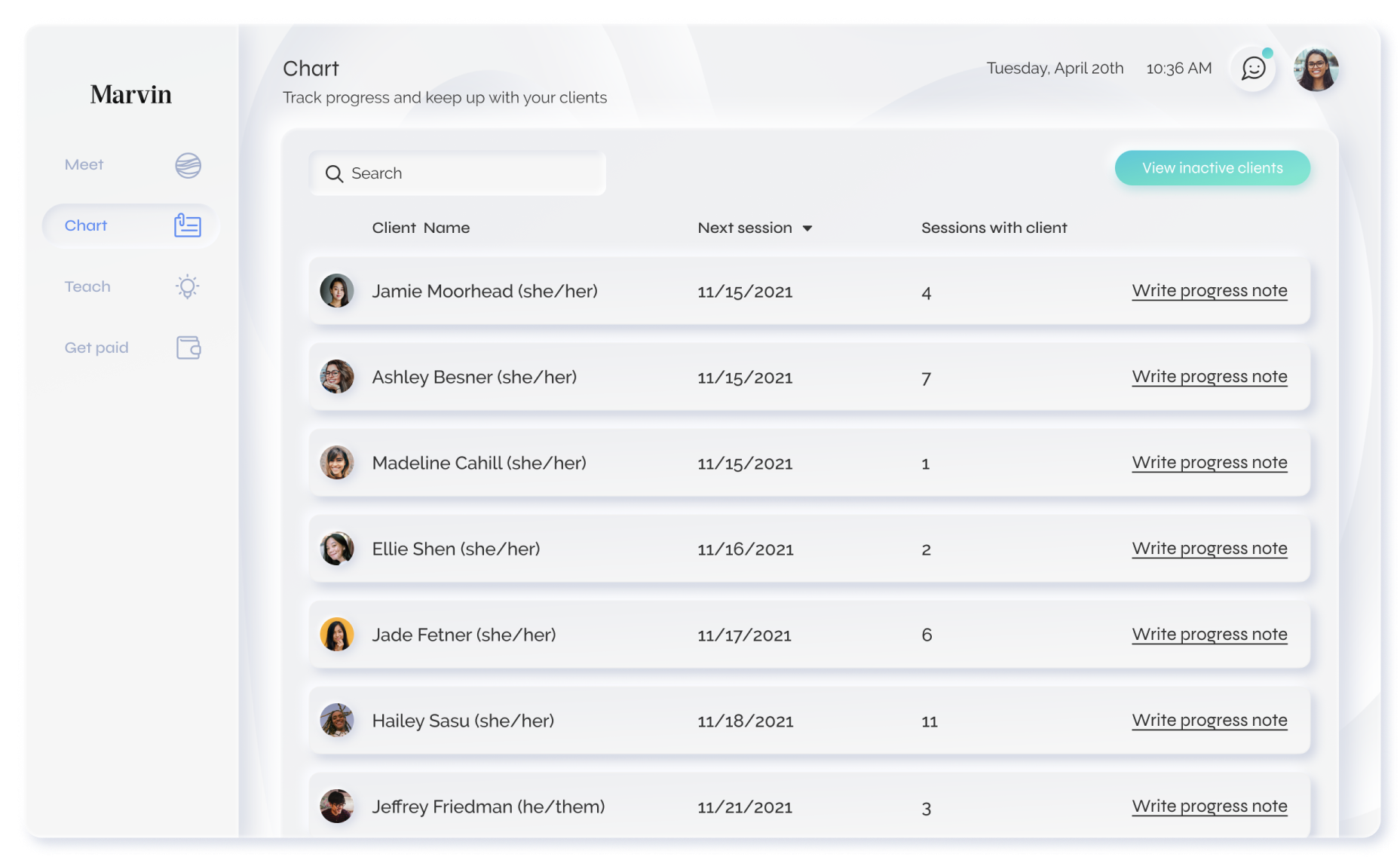
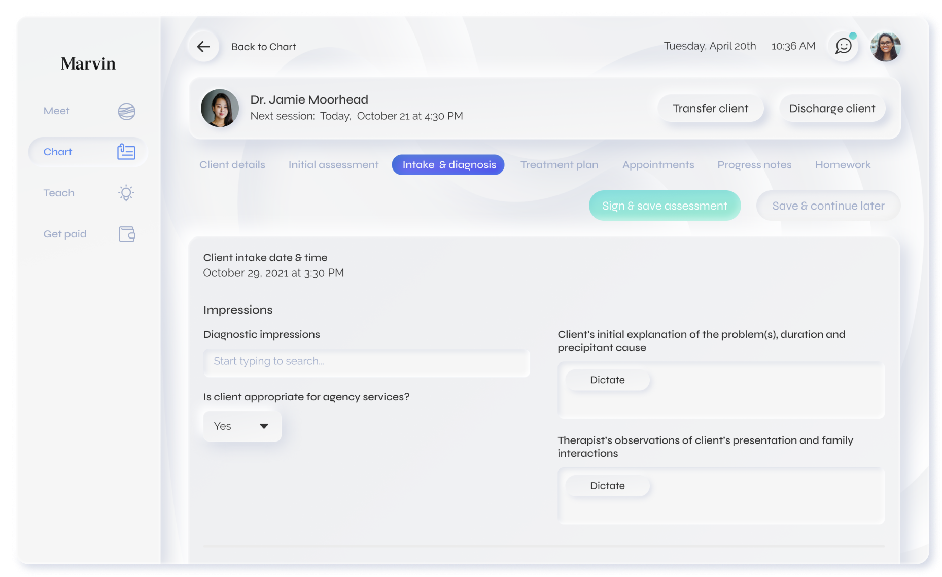
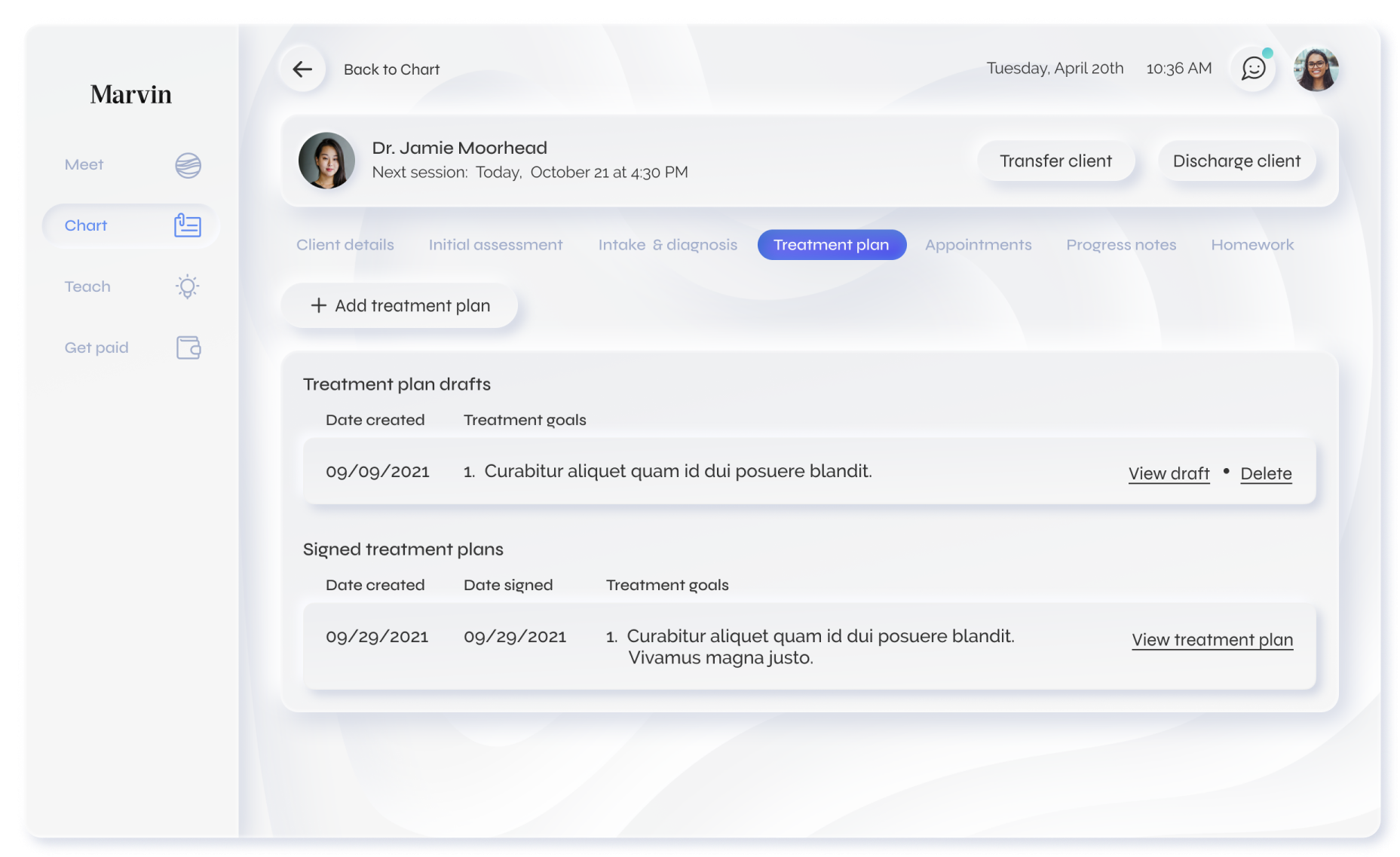
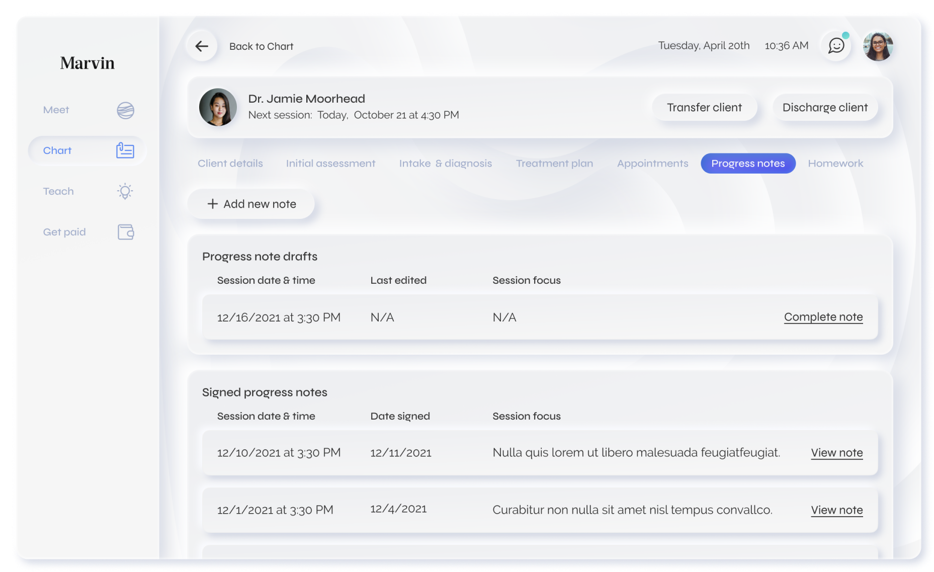
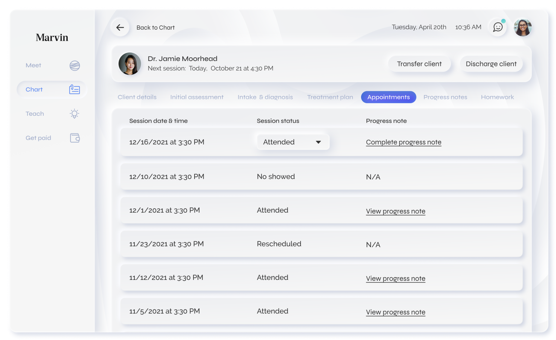
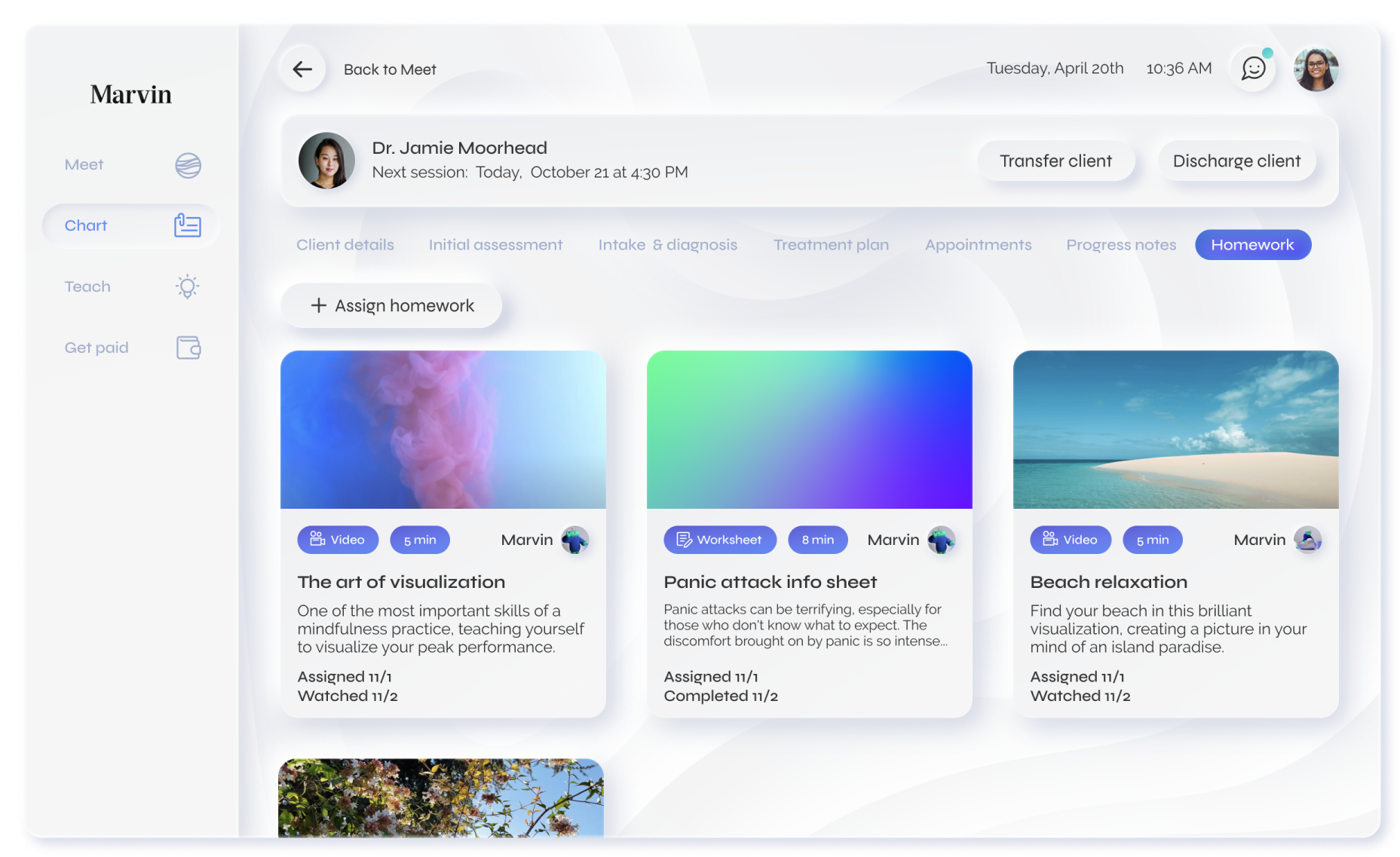
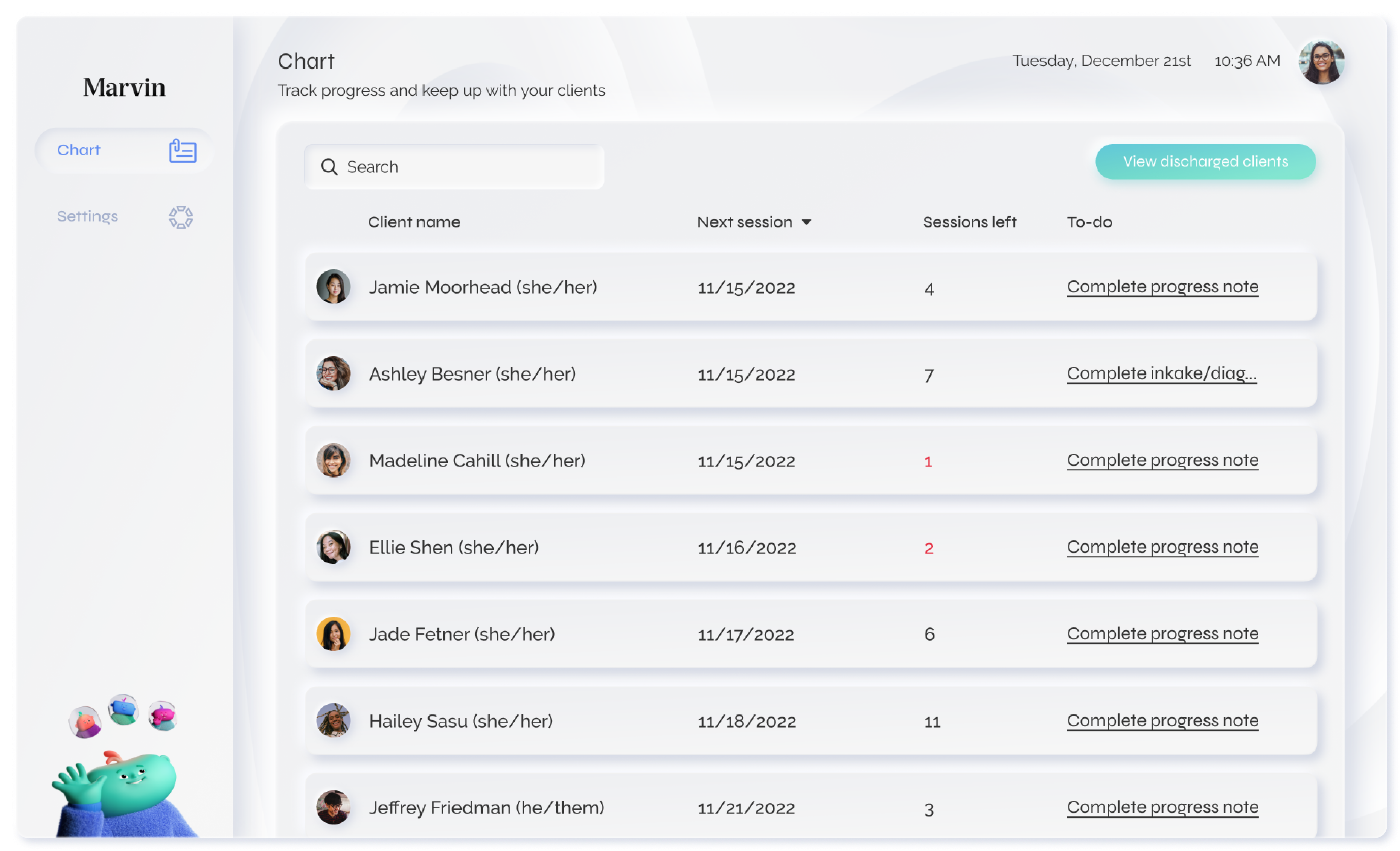
Chart
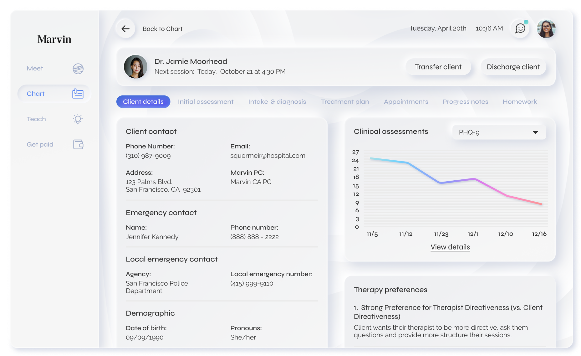
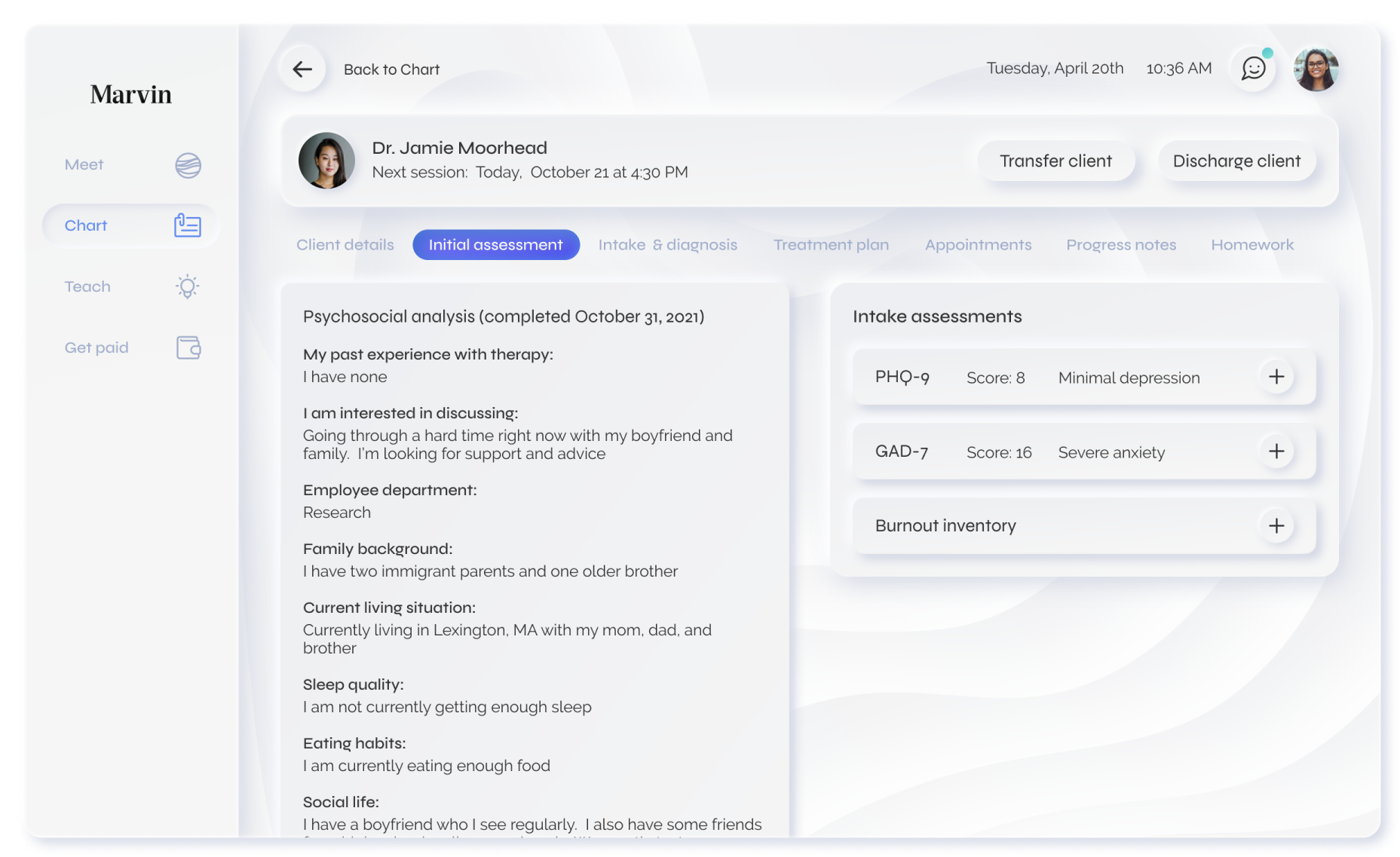
Chart is the access point to Marvin’s custom electronic medical record. It is a list of all active patients, with an option to see a list of patients who have been transferred or discharged. Users can access their patient’s charts by clicking anywhere on their section. The chart is a complete EMR with a secondary horizontal menu. From here, therapists can
View contact info, clinical assessment progress, and therapeutic preferences. Marvin provides customized therapy and strives to foster a collaborative relationship; allowing patients to communicate their therapy preferences is one way of facilitating this.
Review a patient’s initial assessment, including clinical assessments and Marvin’s psychosocial questionnaire.
Complete or review a patient’s intake & diagnosis. This is completed following an intake session.
Add or review treatment plans. Creating a treatment plan for patients is mandatory for Marvin’s therapists.
View any past or scheduled sessions and see if there are any incomplete progress notes for sessions marked as attended.
Add or review progress notes.
Review or assign any homework exercises.
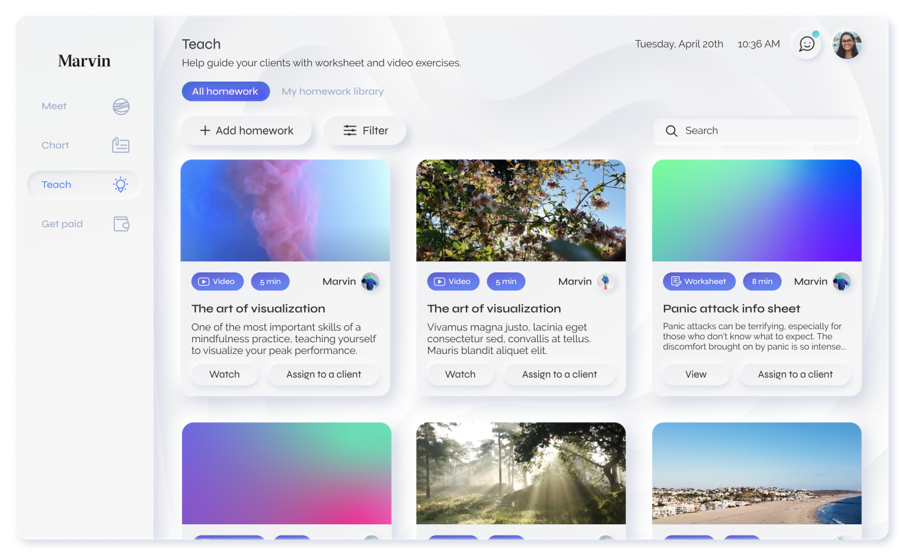
Teach
Teach is a resource library for therapists. Marvin has video and worksheet content therapists can send to their patients as assignments. Often, this helps patients working towards specific mental health goals. Therapists have the option to upload their own resources to share with other Marvin therapists.
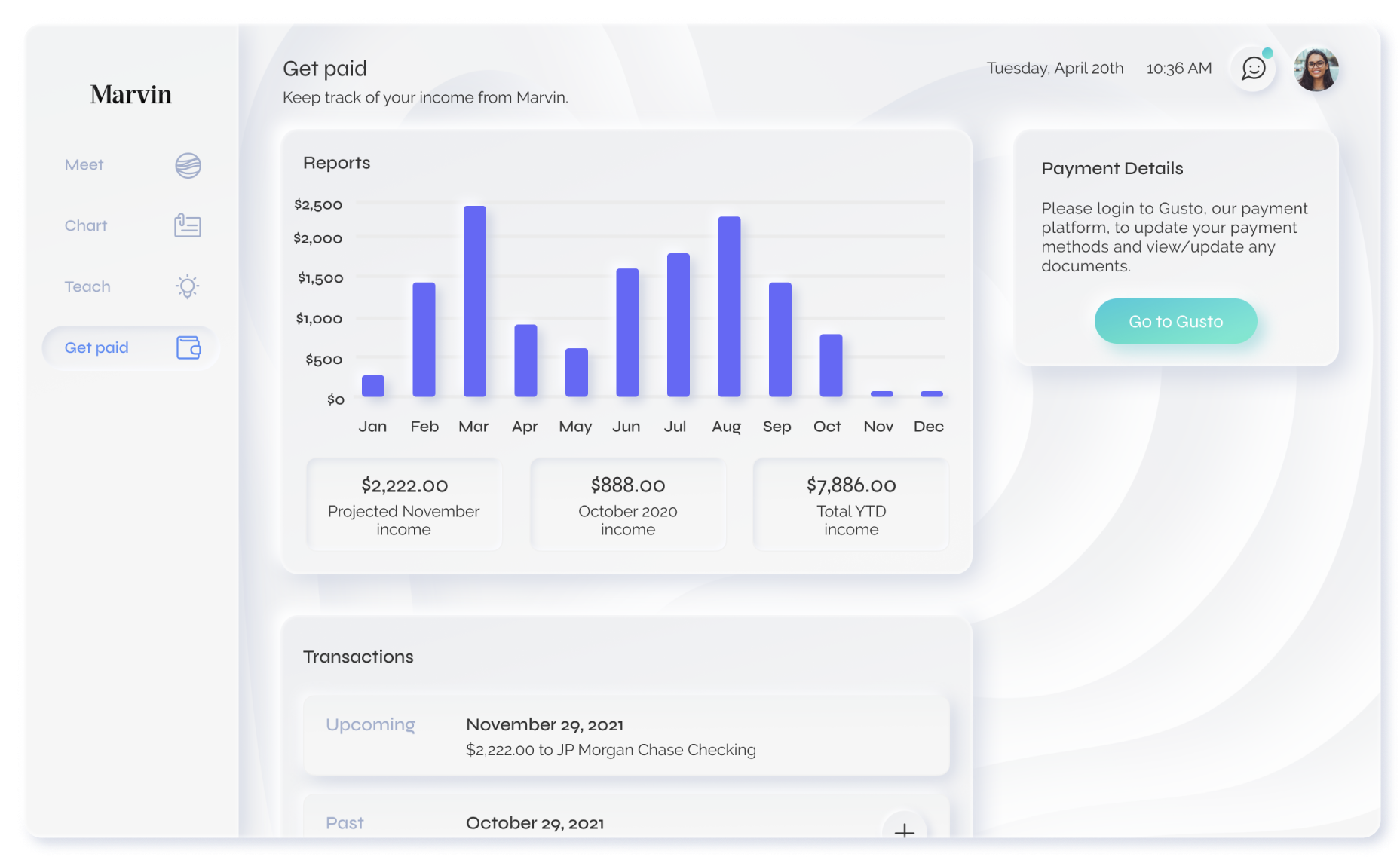
Get paid
Marvin’s therapists are hired as contractors, and whether it be through other platforms or a private practice, they often have other sources of income. To be completely transparent about how much and how often they are getting paid through Marvin, we added “Get paid” as an option in the main navigation, where therapists can easily keep track of any income they receive from seeing Marvin patients.
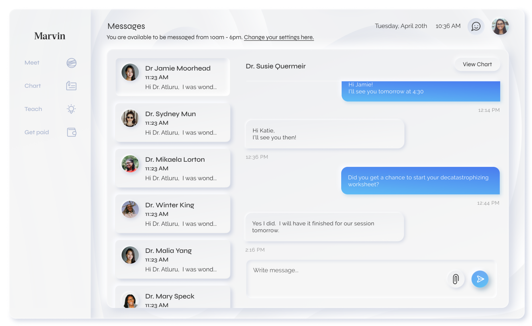
Messaging
Here, therapists can communicate with patients through Marvin’s HIPPA-compliant system. In addition to messaging, there is an option for sending secure attachments. We also included an option to set availability for messaging so it is clear to patients when the therapist can be expected to respond.
Iterating
After user testing and iterating on the above version of the therapist experience to an external engineering team, we created a product roadmap that I designed versions to hand off to engineering. This would include a version with “Chart” and the electronic medical record as the priority, and another with “Meet” and “Chart” as the priorities.