Marvin is a teletherapy platform providing hospital employees with mental health teletherapy and resources.I started working as the sole designer of Marvin in September 2020 to build out all patient and provider-facing apps.
During my time at Marvin, I led the redesign and evolution of Marvin’s patient experience, brand, character, and visual language.
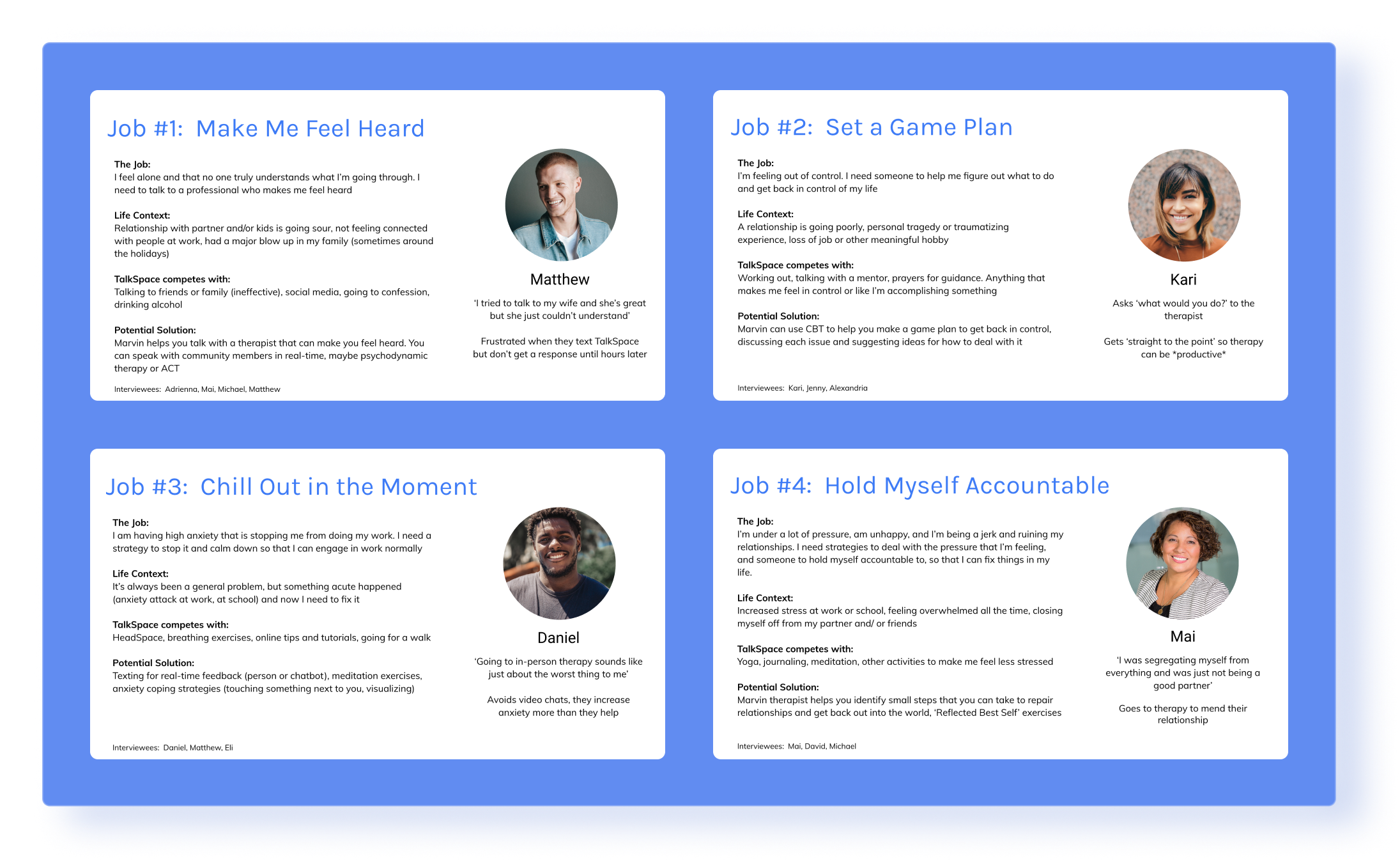
Marvin researchers followed the ‘Jobs-to-be-done’ research framework, which states that when we use a product, we ‘hire’ it to accomplish something in our lives, and to create a product that users want to hire, we need to understand the context of the decision process and the underlying motivations.
To really understand what target users were looking for they conducted user interviews were conducted. All interviewees were healthcare workers who had recently used Talkspace – an indirect competitor in the therapy space. Questions revolved around the context of their life at the time they chose to see a Talkspace therapist, their reasoning for selecting Talkspace, and any alternative solutions they explored.
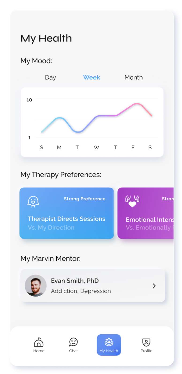
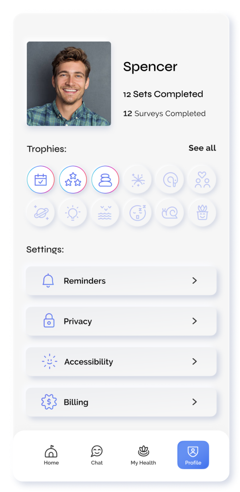
Previous designs
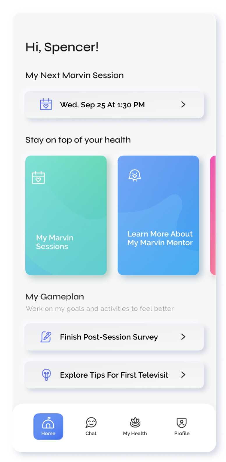
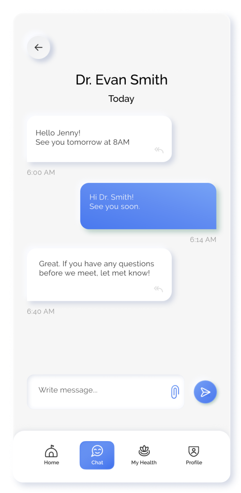
According to the research, Marvin’s potential solutions would include therapy sessions, a variety of therapeutic techniques and exercises (including CBT and ACT), meditation and visualization content, and speaking with community members in real time. Previous designers synthesized this research and created wireframes for four screens: Home, Chat, My Health, and Profile. Initially, I worked with the team to define use cases and user flows, evolve the visual design, and create a high-fidelity prototype. I user-tested the high-fidelity prototype of the redesign, and considering user feedback we decided to redesign our app to focus on the job that Marvin users want to hire us for: seeing a therapist who understands how to help you.
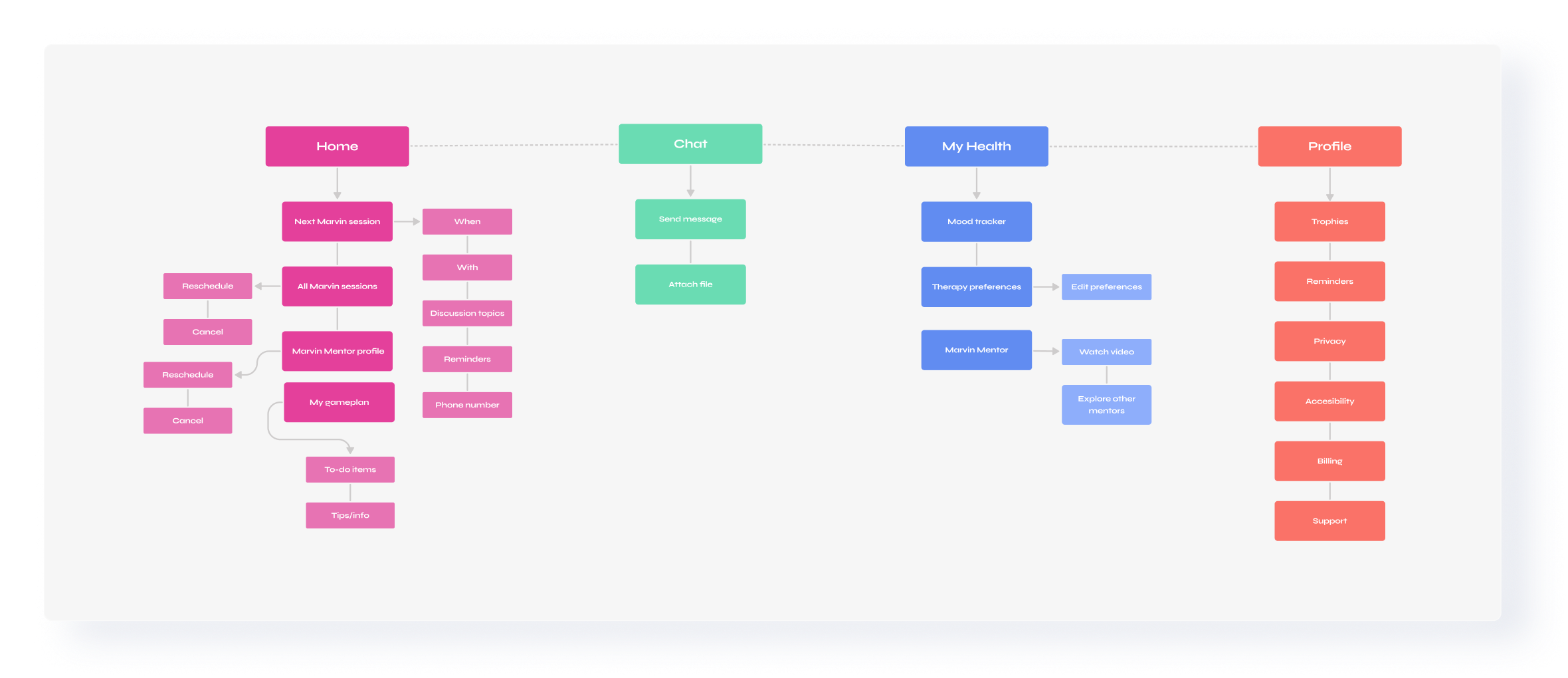
Reconceiving Our Information Architecture
Previous information architecture:
Due to the stigma around mental healthcare, initially, the team wanted to decrease biases about therapy by using words like ‘mentor’ or ‘counselor’ instead of ‘therapist’. However, through our user interviews, it became clear that this was more confusing than helpful for our users. It became clear we needed to be precise about what we offer while remaining friendly and helpful. In addition, many of our user base (healthcare professionals) are very driven and want to make a plan, set goals, and accomplish them. We wanted our menu to remind users that using Marvin is taking action toward their mental health goals.
I began a reorganization of the information architecture by conducting online and in-person card-sorting exercises, synthesizing the results, and creating a new information architecture for our MVP and future states.
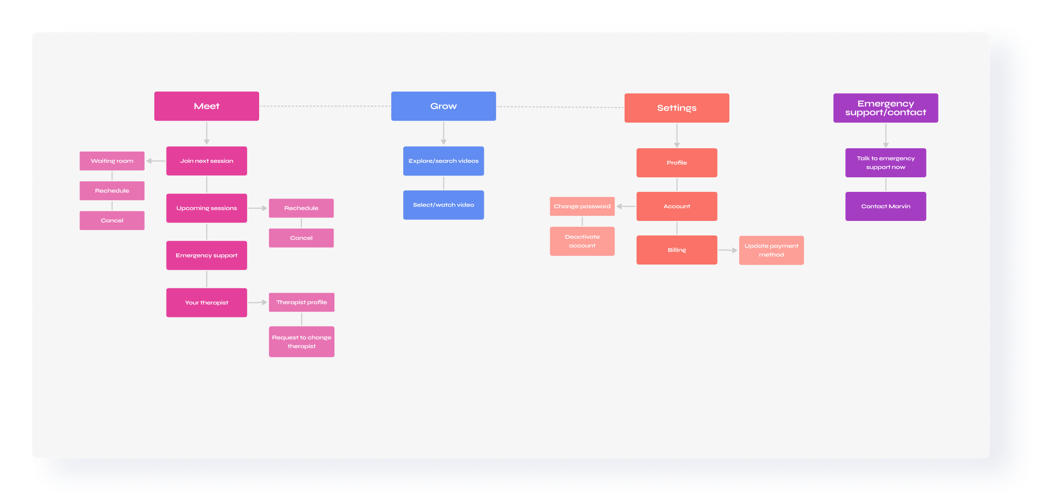
MVP information architecture:
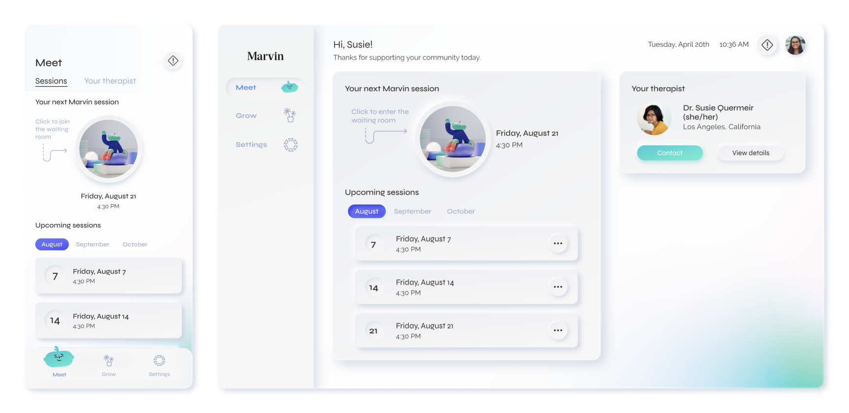
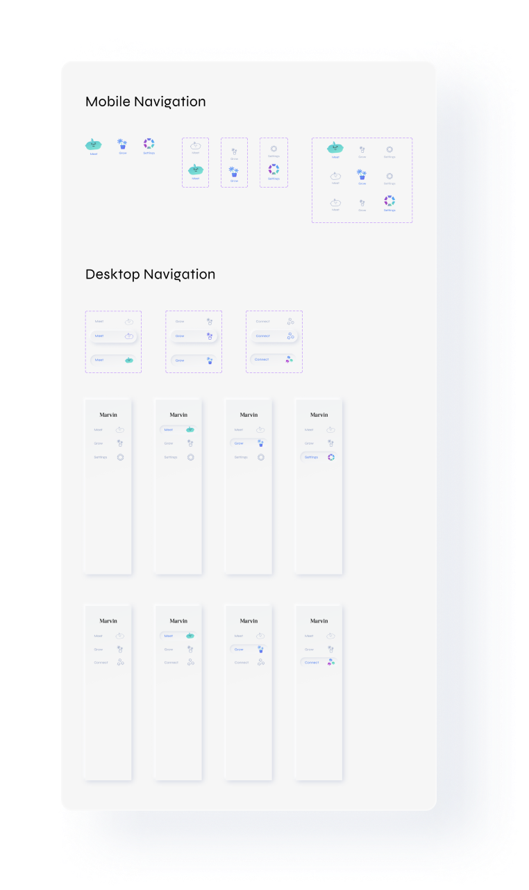
As evidenced through our research, the main reason people choose to hire Marvin is to see a therapist, and a successful therapy journey will accomplish all four jobs. Instead of a traditional home page or dashboard as the default screen, we have Meet, a default screen where users can immediately join their therapy sessions and do anything scheduling-related.
Many competitors in the mental health space offer mental health content exclusively. This type of content focuses on educational, therapeutic, and meditative video content that users who seek therapy have often used to improve anxiety, depression, and stress levels. We also needed a screen where therapy-related video and worksheet content could live. During workshopping sessions, we came up with words like ‘learn’ and ‘relax’. We ultimately decided on Grow after concluding that our content is striving to encourage personal growth, introduce coping methods, and grow out of patterns that don’t serve us anymore.
Low fidelity mobile wireframes
Low fidelity desktop wireframes
Defining Our Visual Language
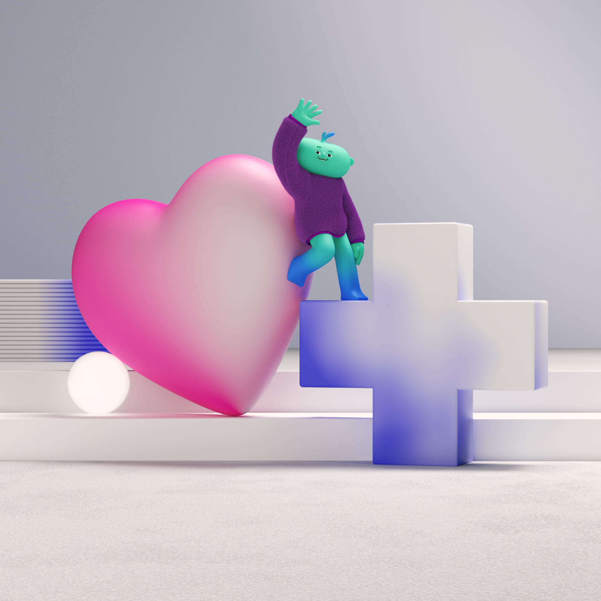
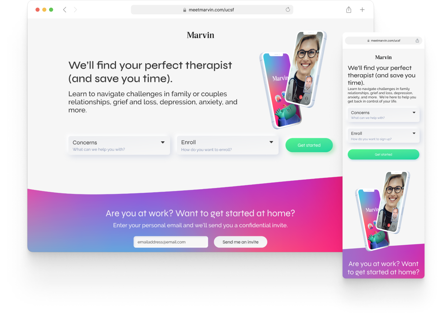
Meet Marvin, your teletherapy guide
When naming Marvin, the founders aimed to choose a name that could serve as a friendly and helpful persona for the often daunting task of finding and seeing a therapist. From 2021-2022 I worked closely with Clim Studio to create Marvin, a friendly 3D character that’s here to help users on their therapy journey. We created 10 scenes (5 looping animations and 5 still images) to integrate into our brand and interface.
Marvin’s brand guidelines
Marvin’s on a mission to help destigmatize and make mental health care more accessible. When evolving the brand, we aimed to keep Marvin vibrant while remaining sleek and sophisticated.
Evolving the User Interface
Over three years I user-tested and iterated on the interface for the patient app. After a product roadmap was created I updated the MVP designs to hand off to engineers. In this version I integrated our character into the interface, he serves as a helpful and friendly face to guide users through their therapy journeys.
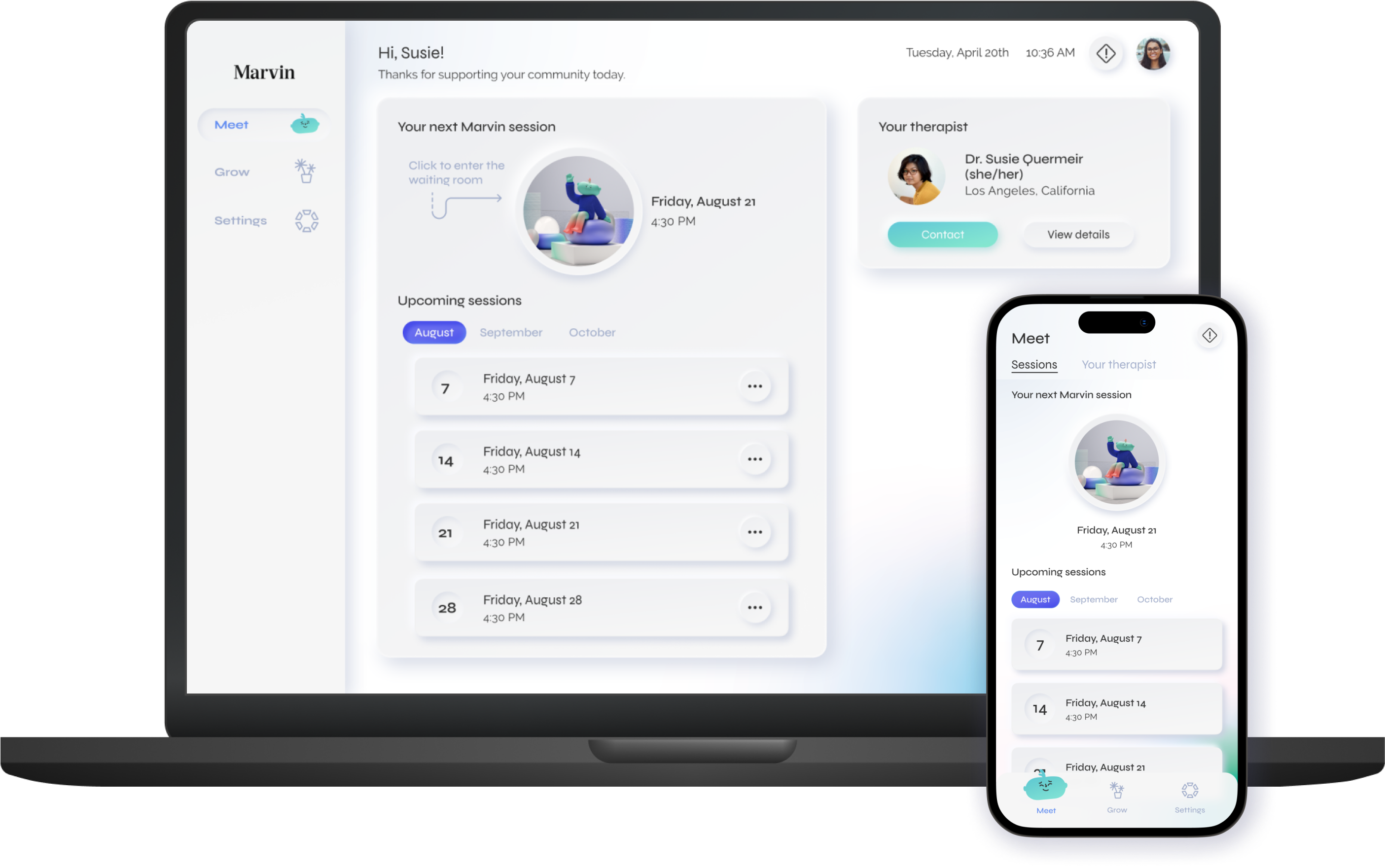
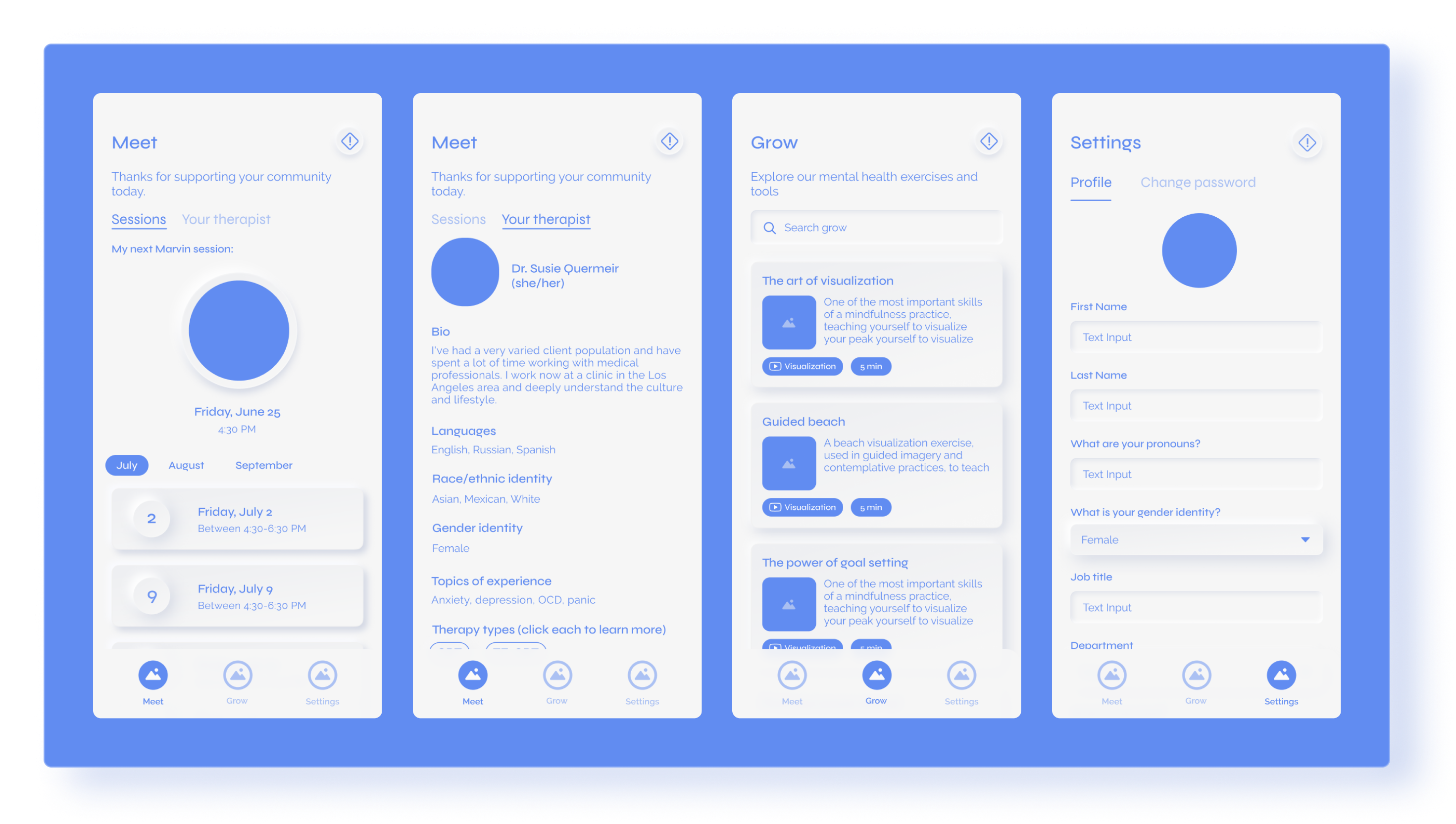
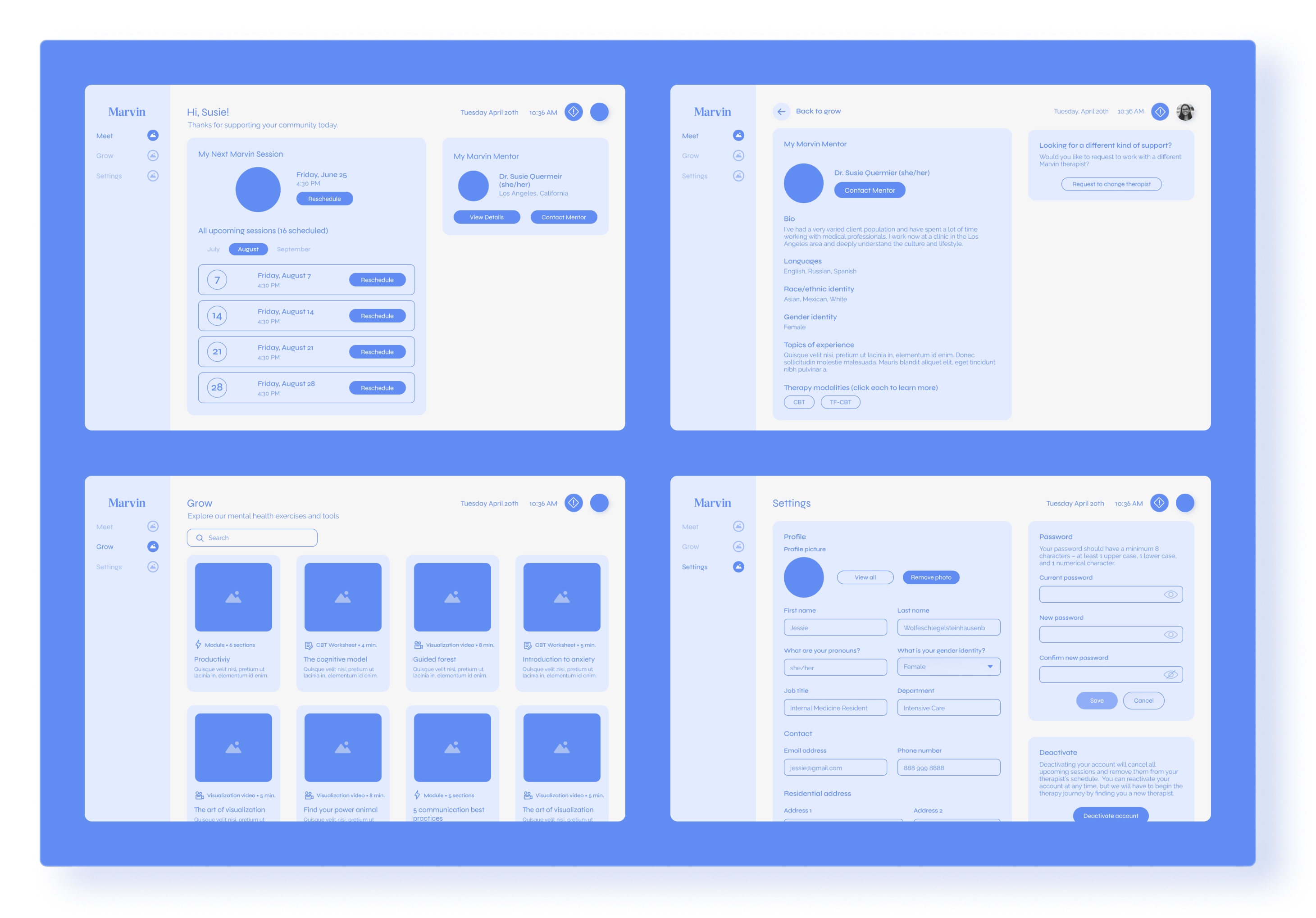
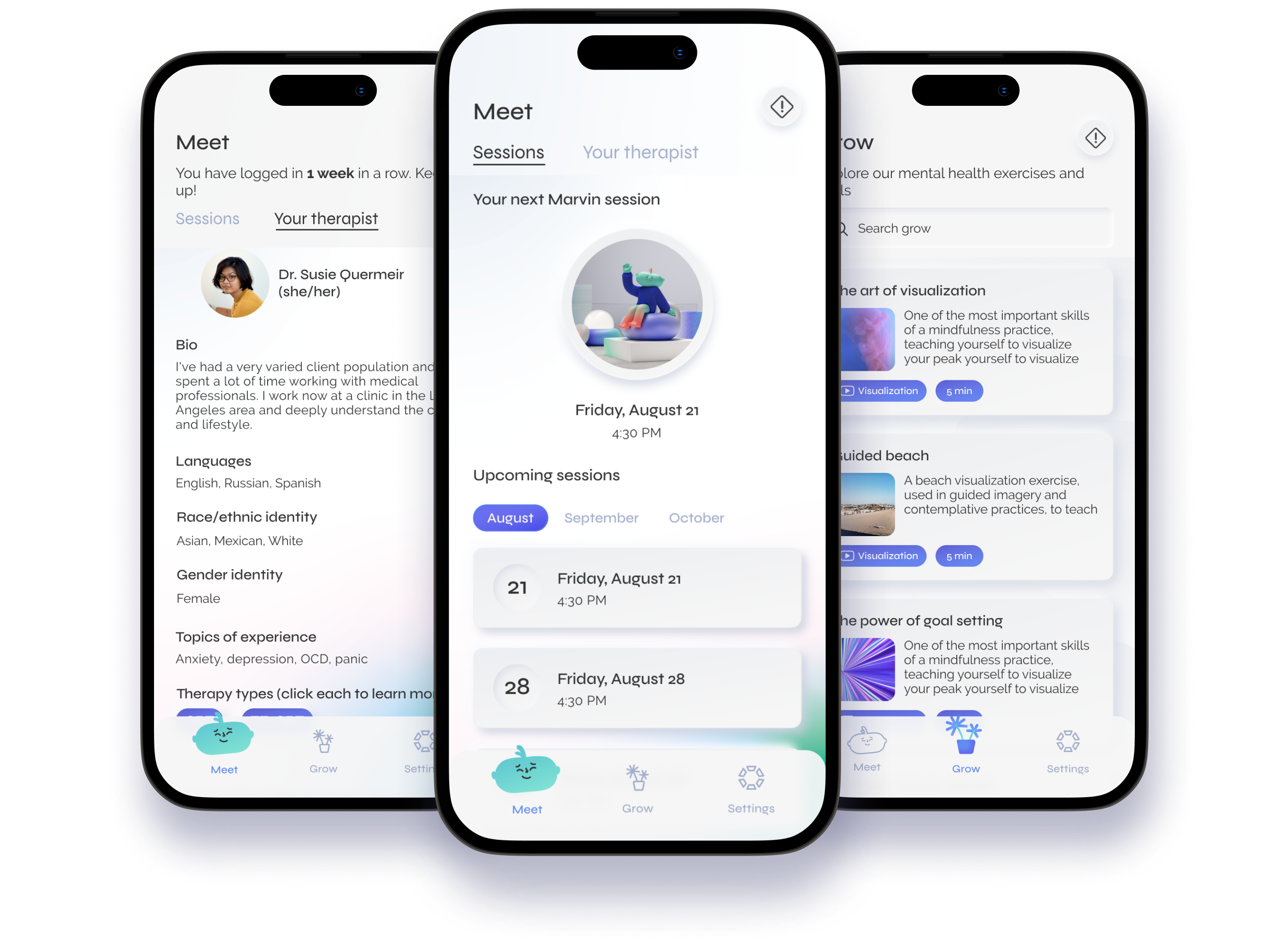
Meet
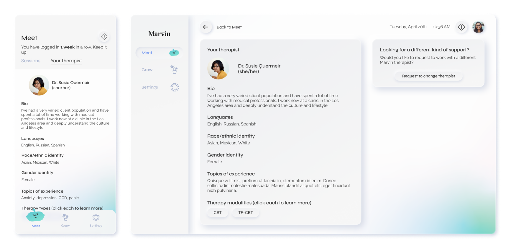
Meet is Marvin’s home screen. From Meet, patients have access to everything revolving around meeting with their therapist. This includes viewing all upcoming sessions (Marvin schedules 12 sessions at a time, with a check-in at the end of those 12 sessions), rescheduling, canceling, and the option to contact their therapist or view their therapist’s details.
Your therapist
Marvin patients are matched with their therapist based on their location, insurance, and therapeutic preferences. In 2022-2023 it was necessary for us to rehaul this process, and I go more in-depth on that in Therapy Registration Flow. We want to provide our patients with a concierge experience, matching them with a therapist who is a good fit from the start. Unfortunately, this isn’t always the case, and to avoid a back-and-forth email marathon with the user success team, there is an option to request a change in therapist from this screen.
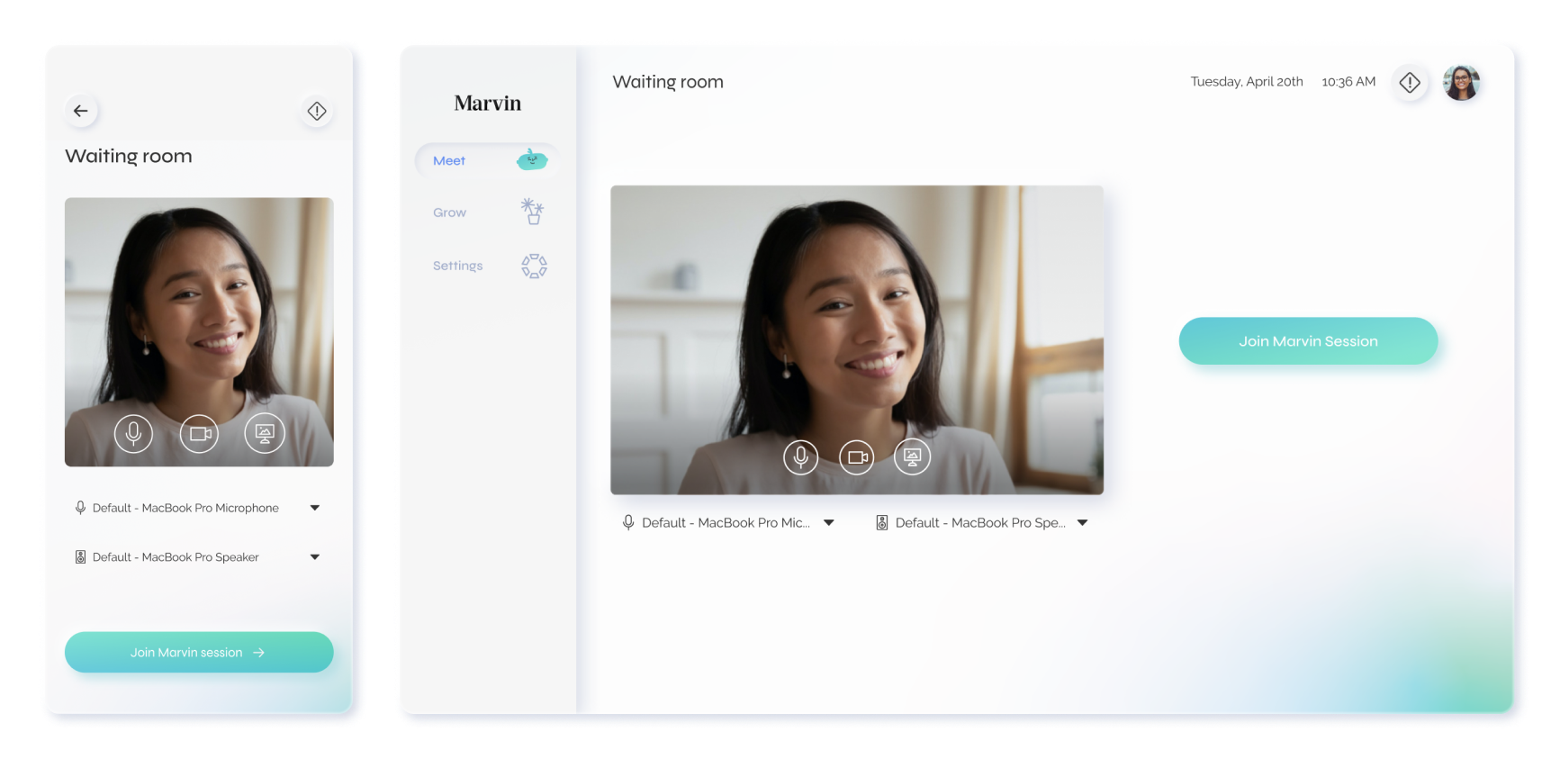
Waiting room
The waiting room is accessible through Meet. Users can test and change their microphone and camera, and turn them on or off upon entrance into the video session.
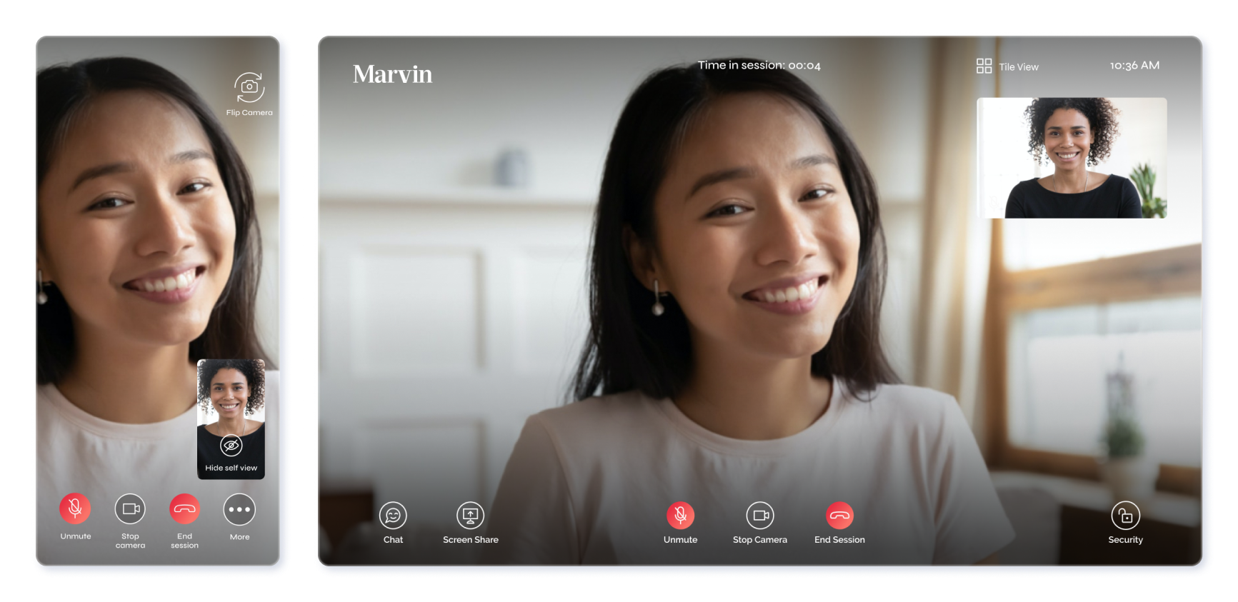
Video session
The video session was designed keeping all our users’ needs in mind. At the top, a timer keeps track of the video session, regardless of whether the screen has been refreshed. The menu at the bottom of the screen has options for messaging, sharing your screen, muting/unmuting your microphone, starting/stopping your camera, ending the session, and security. The security button locks the randomized session link and was a technical requirement to add another level of safety and privacy to the HIPAA-compliant platform.
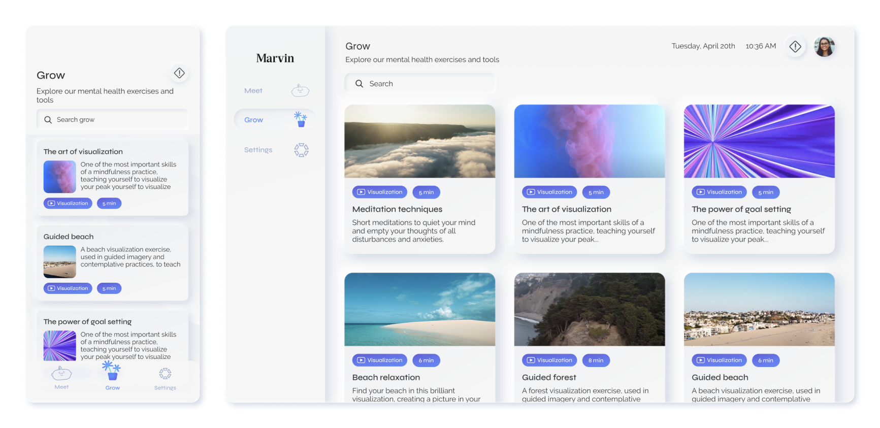
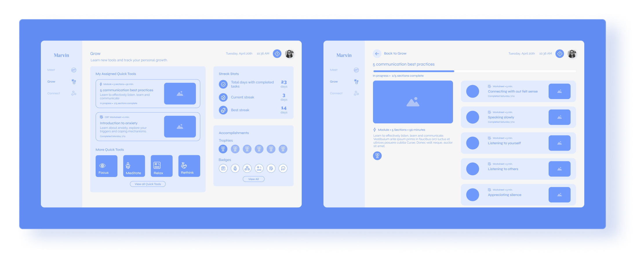
Grow
Grow hosts video and worksheet content. Currently, the library is all video content including visualizations and meditations, but there are worksheets and additional therapeutic resources that will be uploaded in the future. These worksheets are generally chosen by a therapist individually for a patient, and in our therapist experience (which I go more in-depth in Marvin Providers) we have the flow of a therapist choosing and assigning a therapy resource to a patient.
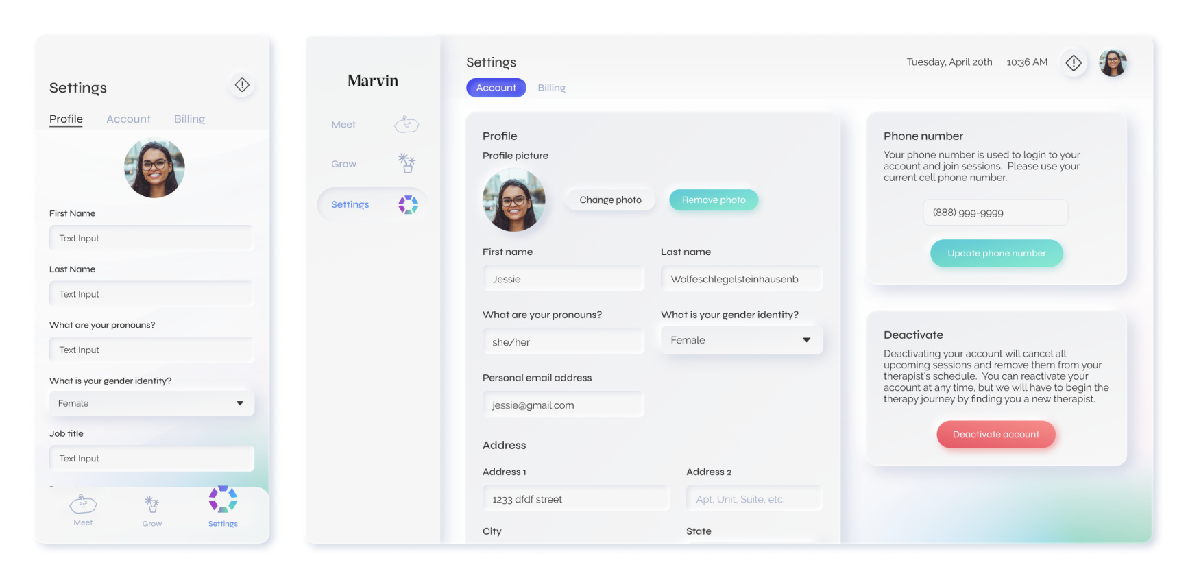
Settings
To minimize the number of emails our billing and user success teams have to answer we included a settings screen where patients can update their basic information, phone number (which is used for login), and billing information. Previously this was all done manually via email and external platforms.
Design System
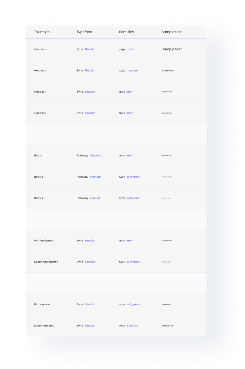
Desktop Typography
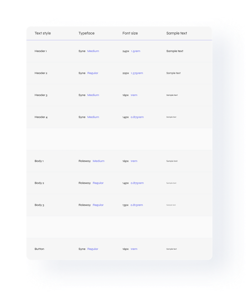
Mobile Typography
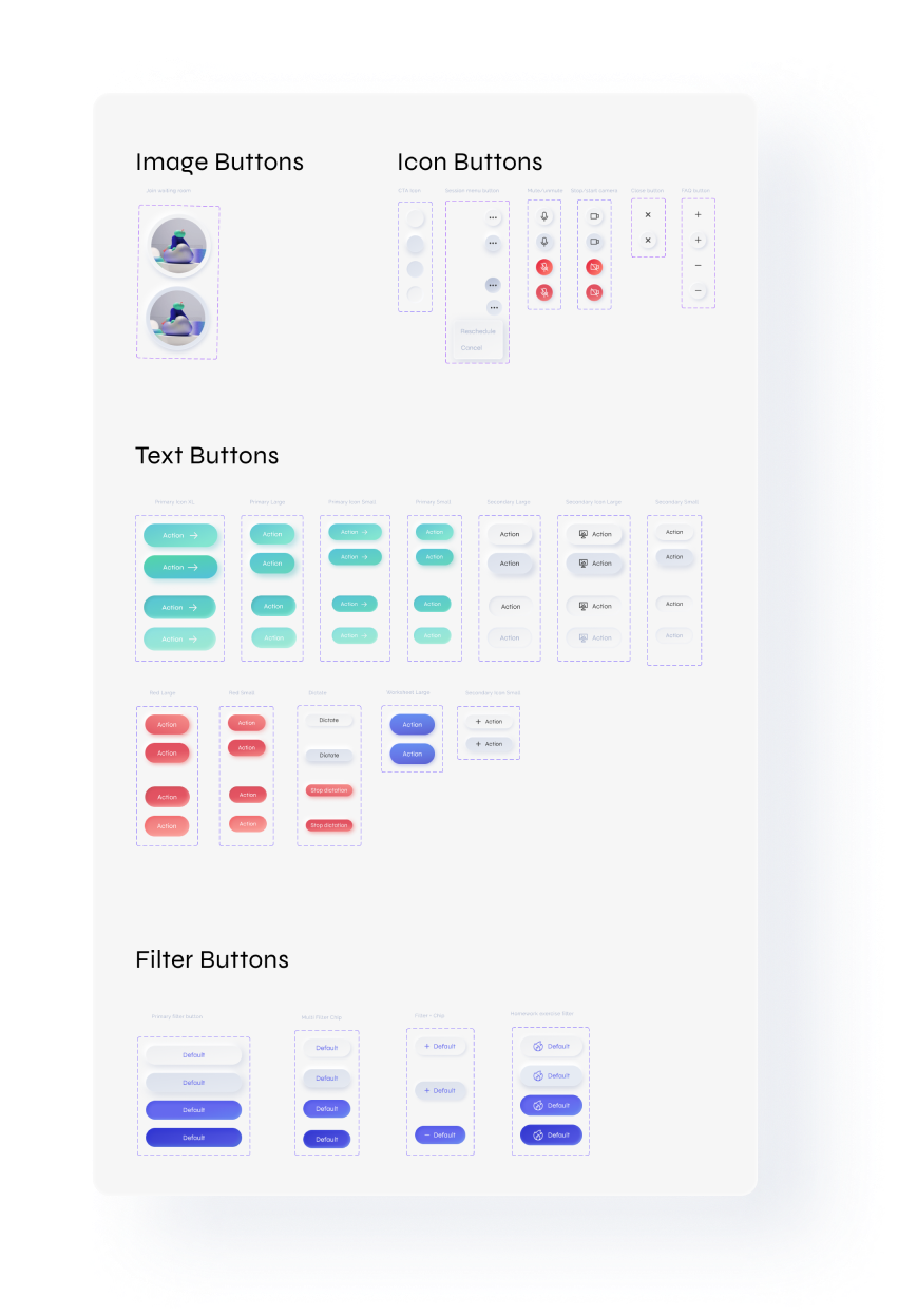
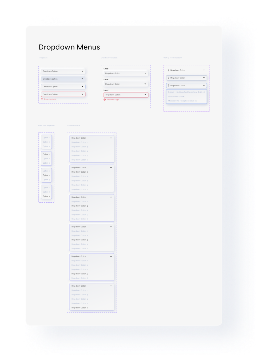
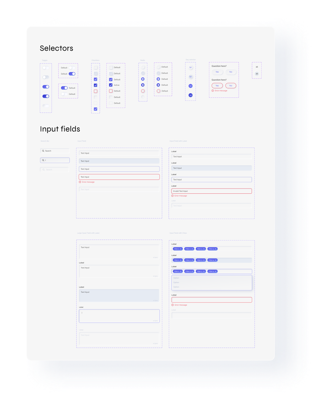
Components
Iconography
Next Steps
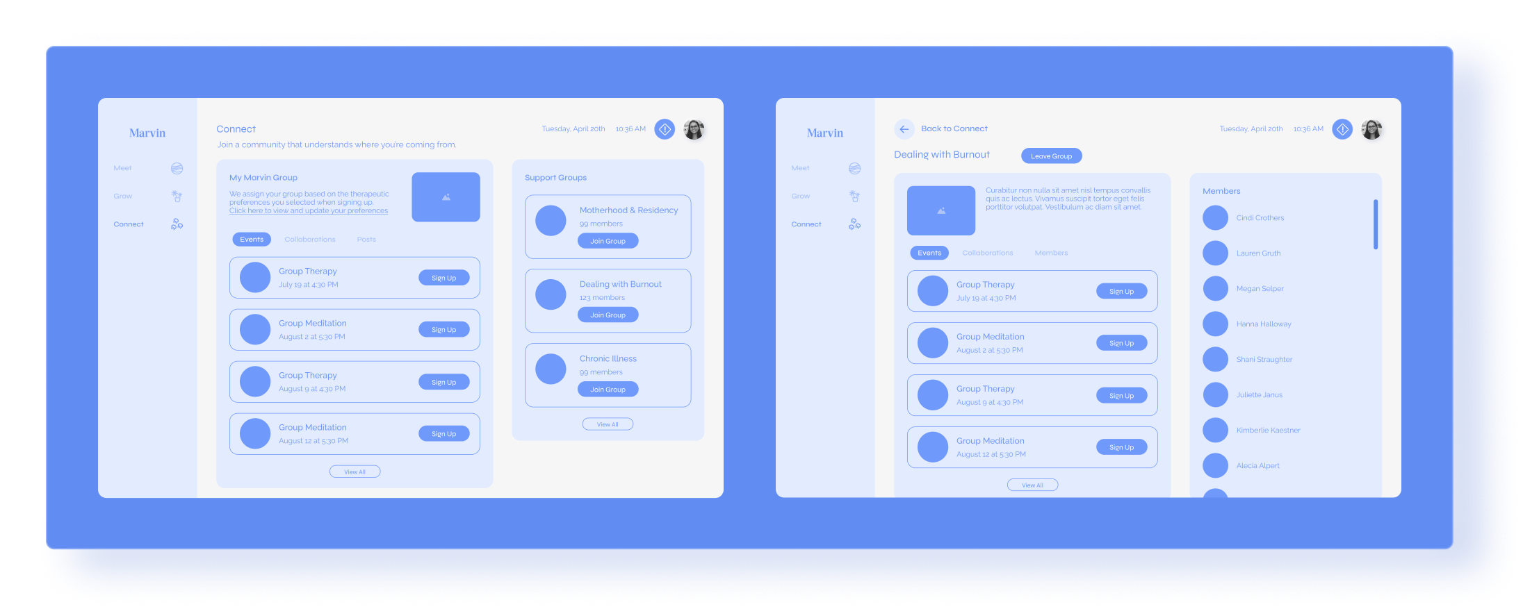
Creating a community
An important insight our researchers found was that healthcare workers often feel isolated and disconnected from people in their lives. The high-stress environment many healthcare workers face on a daily basis can be hard to talk about with people who haven’t experienced it, and many feel they can’t talk about the stressors with people they work closely with and would prefer anonymity. One solution is ‘Connect‘, a community feature in Marvin built around group therapy for Marvin members.
Gamification
Another update I wireframed is the gamification and reorganization of Grow. We wanted to encourage people to interact with content by reorganizing video content into Modules and displaying it as your therapist assigns it. Modules would include any number of videos related to a specific topic, and upon completion, a user would get rewarded in-app for completing assignments, finishing clinical assessments, attending a specific number of sessions, and a number of other tasks or series of tasks.